首页 / CSS / 纯CSS实现带小三角提示框
纯CSS实现带小三角提示框
内容导读
互联网集市收集整理的这篇技术教程文章主要介绍了纯CSS实现带小三角提示框,小编现在分享给大家,供广大互联网技能从业者学习和参考。文章包含4815字,纯文字阅读大概需要7分钟。
内容图文

要实现在页面上点击指定元素时,弹出一个信息提示框。在前面的文章中,我们已经简单介绍了如何使用纯 CSS 创建一个三角形。本文在此基础上,记录如何使用 CSS 创建带三角形的提示框。
实现的原理是创建一个div提示框,然后再创建一个三角形,将三角形用绝对定位(absolute)到提示框对应的位置。
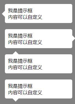
一、创建不带边框的提示框:
之前已介绍过怎么生成三角形,直接代码如下:
<style>
body {
margin: 0;
padding: 0;
background: grey;
}
/*提示框容器*/
.tip {
position: relative;
margin-left: 20px;
margin-top: 20px;
width: 200px;
background: #fff;
padding: 10px;
/*设置圆角*/
-webkit-border-radius: 5px;
-moz-border-radius: 5px;
border-radius: 5px;
}
/*提示框-左三角*/
.tip-trangle-left {
position: absolute;
bottom: 15px;
left: -10px;
width: 0;
height: 0;
border-top: 15px solid transparent;
border-bottom: 15px solid transparent;
border-right: 15px solid #fff;
}
/*提示框-右三角*/
.tip-trangle-right {
position: absolute;
top: 15px;
right: -10px;
width: 0;
height: 0;
border-top: 15px solid transparent;
border-bottom: 15px solid transparent;
border-left: 15px solid #fff;
}
/*提示框-上三角*/
.tip-trangle-top {
position: absolute;
top: -10px;
left: 20px;
width: 0;
height: 0;
border-left: 15px solid transparent;
border-right: 15px solid transparent;
border-bottom: 15px solid #fff;
}
/*提示框-下三角*/
.tip-trangle-bottom {
position: absolute;
bottom: -10px;
left: 20px;
width: 0;
height: 0;
border-left: 15px solid transparent;
border-right: 15px solid transparent;
border-top: 15px solid #fff;
}
</style>
<div class="tip">
<div class="tip-trangle-left"></div>
我是提示框<br/>
内容可以自定义
</div>
<div class="tip">
<div class="tip-trangle-right"></div>
我是提示框<br/>
内容可以自定义
</div>
<div class="tip">
<div class="tip-trangle-top"></div>
我是提示框<br/>
内容可以自定义
</div>
<div class="tip">
<div class="tip-trangle-bottom"></div>
我是提示框<br/>
内容可以自定义
</div>
以上代码效果如下(我们实现了箭头在4个不同方向的提示框,在使用时可根据自身需要进行调整):
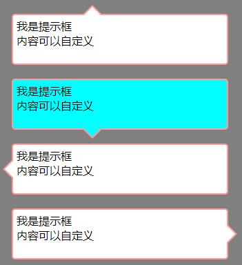
二、创建带边框的提示框:
第一步实现了不带边框的提示框,如果要实现带边框的提示框,原理是先把提示框容器加上边框,然后通过伪元素,在需要带箭头的边框上面生成2个三角形,最后改变最上面的三角形的颜色(和提示框的内容背景色相同),即可实现。代码如下:
<style>
body {
margin: 0;
padding: 0;
background: grey;
}
/*提示框容器-上三角形*/
.tip-top {
margin: 20px;
padding: 5px;
width: 300px;
height: 60px;
border: 2px solid #f99;
position: relative;
background-color: #FFF;
/*设置圆角*/
-webkit-border-radius: 5px;
-moz-border-radius: 5px;
border-radius: 5px;
}
/*生成2个叠加的三角形*/
.tip-top:before, .tip-top:after {
content: "";
display: block;
border-width: 15px;
position: absolute;
top: -30px;
left: 100px;
border-style: solid dashed dashed solid;
border-color: transparent transparent #f99 transparent;
font-size: 0;
line-height: 0;
}
/*将上面的三角形颜色设置和容器背景色相同*/
.tip-top:after {
top: -27px;
border-color: transparent transparent #FFF transparent;
}
/*下三角*/
.tip-bottom {
margin: 20px;
padding: 5px;
width: 300px;
height: 60px;
border: 2px solid #f99;
position: relative;
background-color: #0FF;
/*设置圆角*/
-webkit-border-radius: 5px;
-moz-border-radius: 5px;
border-radius: 5px;
}
.tip-bottom:before, .tip-bottom:after {
content: "";
display: block;
border-width: 15px;
position: absolute;
bottom: -30px;
left: 100px;
border-style: solid dashed dashed solid;
border-color: #f99 transparent transparent transparent;
font-size: 0;
line-height: 0;
}
.tip-bottom:after {
bottom: -27px;
border-color: #0FF transparent transparent transparent;
}
/*左三角*/
.tip-left {
margin: 20px;
padding: 5px;
width: 300px;
height: 60px;
border: 2px solid #f99;
position: relative;
background-color: #FFF;
/*设置圆角*/
-webkit-border-radius: 5px;
-moz-border-radius: 5px;
border-radius: 5px;
}
.tip-left:before, .tip-left:after {
content: "";
display: block;
border-width: 15px;
position: absolute;
left: -30px;
top: 20px;
border-style: dashed solid solid dashed;
border-color: transparent #f99 transparent transparent;
font-size: 0;
line-height: 0;
}
.tip-left:after {
left: -27px;
border-color: transparent #FFF transparent transparent;
}
/*右三角*/
.tip-right {
margin: 20px;
padding: 5px;
width: 300px;
height: 60px;
border: 2px solid #f99;
position: relative;
background-color: #FFF;
/*设置圆角*/
-webkit-border-radius: 5px;
-moz-border-radius: 5px;
border-radius: 5px;
}
.tip-right:before, .tip-right:after {
content: "";
display: block;
border-width: 15px;
position: absolute;
right: -30px;
top: 20px;
border-style: dashed solid solid dashed;
border-color: transparent transparent transparent #f99;
font-size: 0;
line-height: 0;
}
.tip-right:after {
right: -27px;
border-color: transparent transparent transparent #FFF;
}
</style>
<div class="tip-top">
我是提示框<br/>
内容可以自定义
</div>
<div class="tip-bottom">
我是提示框<br/>
内容可以自定义
</div>
<div class="tip-left">
我是提示框<br/>
内容可以自定义
</div>
<div class="tip-right">
我是提示框<br/>
内容可以自定义
</div>
</body>
以上代码效果如下(我们实现了箭头在4个不同方向的提示框,在使用时可根据自身需要进行调整):
通过以上两个例子,展示了如何生成简单的提示框。而对于有边框的提示框,如果边框颜色和内容区背景色相同,也会实现无边框的提示框效果。在使用时,可以根据自己需要,调整代码。
原文:https://www.cnblogs.com/houxianzhou/p/14651537.html
内容总结
以上是互联网集市为您收集整理的纯CSS实现带小三角提示框全部内容,希望文章能够帮你解决纯CSS实现带小三角提示框所遇到的程序开发问题。 如果觉得互联网集市技术教程内容还不错,欢迎将互联网集市网站推荐给程序员好友。
内容备注
版权声明:本文内容由互联网用户自发贡献,该文观点与技术仅代表作者本人。本站仅提供信息存储空间服务,不拥有所有权,不承担相关法律责任。如发现本站有涉嫌侵权/违法违规的内容, 请发送邮件至 gblab@vip.qq.com 举报,一经查实,本站将立刻删除。
内容手机端
扫描二维码推送至手机访问。