纯CSS自定义Html中Checkbox复选框样式
内容导读
互联网集市收集整理的这篇技术教程文章主要介绍了纯CSS自定义Html中Checkbox复选框样式,小编现在分享给大家,供广大互联网技能从业者学习和参考。文章包含7089字,纯文字阅读大概需要11分钟。
内容图文

原文链接:http://www.lrxin.com/archives-683.html
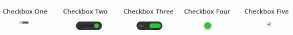
首先看下效果:
点击演示地址查看实例。
首先,需要添加一段CSS隐藏所有的Checkbox复选框,之后我们会改变它的外观。
要做到这一点需要添加一段代码到你的CSS文件中。
            /*
            *
 * 隐藏默认的checkbox

            */

input[type=checkbox] {
visibility: hidden;
}
隐藏掉所有的Checkbox复选框后,我们需要添加一个label HTML元素,我们都知道,当点击的有for属性的label标签时,对应的Checkbox复选框会被选中。这意味着,我们可以通过label的点击事件来处理我们的Checkbox复选框。
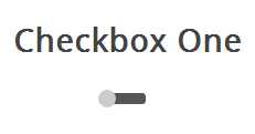
此复选框风格就像一个解锁滑块,滑块选中和未选中状态会显示在的不同位置。当单击滑块按钮(label标签),将会选中复选框,然后滑块移动到ON位置。
我们开始创建复选框区的HTML。
            <
            section
            >
            <!--
             Checbox One
            -->
            <
            h3
            >Checkbox One</h3><div class="checkboxOne"><input type="checkbox" value="1" id="checkboxOneInput" name=""/><label for="checkboxOneInput"></label></div></section>
因为这个样式的复选框,一个label不足以完成任务,我们用一个DIV元素包含checkbox,我们需要使用它们来做黑色条带和圆角。
            /*
            *
 * Create the slider bar

            */

.checkboxOne {
    width: 40px;
    height: 10px;
    background: #555;
    margin: 20px 80px;
    position: relative;
    border-radius: 3px;
}
现在,我们可以把label作为条带上的滑块,我们希望按钮效果是从条带的一侧移动到另一侧,我们可以添加label的过渡。
            /*
            *
 * Create the slider from the label

            */

.checkboxOne label {
    display: block;
    width: 16px;
    height: 16px;
    border-radius: 50%;

    -webkit-transition: all .5s ease;
    -moz-transition: all .5s ease;
    -o-transition: all .5s ease;
    -ms-transition: all .5s ease;
    transition: all .5s ease;
    cursor: pointer;
    position: absolute;
    top: -3px;
    left: -3px;

    background: #ccc;
}
现在这个滑块在选中(关闭)位置,当我们选中复选框,我们希望有一个反应发生,所以我们可以移动滑块到另一端。我们需要知道,判断复选框被选中,如果是则改变label元素的left属性。
            /*
            *
 * Move the slider in the correct position if the checkbox is clicked

            */

.checkboxOne input[type=checkbox]:checked + label {
    left: 27px;
}
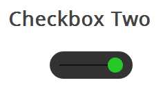
此复选框风格像样式一样,但不同的是,这个滑块按钮会改变颜色。当您单击滑块按钮,它移动到条带的另一边,并改变按钮的颜色。
HTML代码和样式一是完全一样的。
            <
            section
            >
            <!--
             Checbox Two
            -->
            <
            h3
            >Checkbox Two</h3><div class="checkboxTwo"><input type="checkbox" value="1" id="checkboxTwoInput" name=""/><label for="checkboxTwoInput"></label></div></section>
这个DIV会变成比样式一大一些的条带,label依然是作为滑块,使用下面的CSS来定义它。
这个样式中间有一个黑色的条,滑块会沿着它左右滑动,但是DIV元素已经使用了,所以我们需要用:before伪类创建一个新的元素。
            /*
            *
 * Create the line for the circle to move across

            */

.checkboxTwo:before {
    content: ‘‘;
    position: absolute;
    top: 19px;
    left: 14px;
    height: 2px;
    width: 90px;
    background: #111;
}
接下来我们为label写CSS样式,把它用作滑块。
            /*
            *
 * Create the circle to click

            */

.checkboxTwo label {
    display: block;
    width: 22px;
    height: 22px;
    border-radius: 50%;

    -webkit-transition: all .5s ease;
    -moz-transition: all .5s ease;
    -o-transition: all .5s ease;
    -ms-transition: all .5s ease;
    transition: all .5s ease;
    cursor: pointer;
    position: absolute;
    top: 9px;
    z-index: 1;
    left: 12px;
    background: #ddd;
}
当选中时改变label的left和background属性。
            /*
            *
 * Create the click event for the checkbox

            */

.checkboxTwo input[type=checkbox]:checked + label {
    left: 84px;
    background: #26ca28;
}
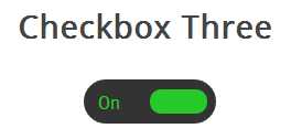
它和前面的例子一样会左右滑动,并且当改变选中和未选中的状态时,滑块滑动到另一侧并且在原位置显示对应的文本。
首先,我们写HTML代码,这和前面是相同的。
            <
            section
            >
            <!--
             Checbox Three
            -->
            <
            h3
            >Checkbox Three</h3><div class="checkboxThree"><input type="checkbox" value="1" id="checkboxThreeInput" name=""/><label for="checkboxThreeInput"></label></div></section>
然后,我们用相同的方式把div作为滑块,下面的代码会创建一个黑色圆角的条带,我们可以把滑块和文本放到里面。
            /*
            *
 * Checkbox Three

            */

.checkboxThree {
    width: 120px;
    height: 40px;
    background: #333;
    margin: 20px 60px;

    border-radius: 50px;
    position: relative;
}
当滑块处于未选中状态时,滑块会在左侧,并且右边显示”OFF”,当点击的时候,滑块移动到右侧,左侧显示”ON”。
但是元素数量不足以让我们实现这些功能,所以我们要用:before和:after两个伪类创建两个元素,分别放置”ON”和”OFF”。
            /*
            *
 * Create the text for the On position

            */

.checkboxThree:before {
    content: ‘On‘;
    position: absolute;
    top: 12px;
    left: 13px;
    height: 2px;
    color: #26ca28;
    font-size: 16px;
}
/**
 * Create the text for the off position
 */
.checkboxThree:after {
    content: ‘Off‘;
    position: absolute;
    top: 12px;
    left: 84px;
    height: 2px;
    color: #ddd;
    font-size: 16px;
}
我们来添加滑块的样式,当被点击时它会移动到另一侧,并且改变颜色。
            /*
            *
 * Create the pill to click

            */

.checkboxThree label {
    display: block;
    width: 52px;
    height: 22px;
    border-radius: 50px;

    -webkit-transition: all .5s ease;
    -moz-transition: all .5s ease;
    -o-transition: all .5s ease;
    -ms-transition: all .5s ease;
    transition: all .5s ease;
    cursor: pointer;
    position: absolute;
    top: 9px;
    z-index: 1;
    left: 12px;
    background: #ddd;
}

/**
 * Create the checkbox event for the label
 */
.checkboxThree input[type=checkbox]:checked + label {
    left: 60px;
    background: #26ca28;
}

在这个样式中,我们会创建两个圆形,当点击时改变里面的圆形的颜色表示选中与未选中的状态。
和前面一样的HTML代码。
            <
            section
            >
            <!--
             Checbox Four
            -->
            <
            h3
            >Checkbox Four</h3><div class="checkboxFour"><input type="checkbox" value="1" id="checkboxFourInput" name=""/><label for="checkboxFourInput"></label></div></section>
接下来我们要为checkbox创建外面的圆形,使用CSS的border-radius属性,并且设置为100%就可以创建一个正圆形。
            /*
            *
 * Checkbox Four

            */

.checkboxFour {
    width: 40px;
    height: 40px;
    background: #ddd;
    margin: 20px 90px;

    border-radius: 100%;
    position: relative;
    -webkit-box-shadow: 0px 1px 3px rgba(0,0,0,0.5);
    -moz-box-shadow: 0px 1px 3px rgba(0,0,0,0.5);
    box-shadow: 0px 1px 3px rgba(0,0,0,0.5);
}
然后我们用label元素来创建一个小一点的圆形,它会根据checkbox状态来改变颜色。
            /*
            *
 * Create the checkbox button

            */

.checkboxFour label {
    display: block;
    width: 30px;
    height: 30px;
    border-radius: 100px;

    -webkit-transition: all .5s ease;
    -moz-transition: all .5s ease;
    -o-transition: all .5s ease;
    -ms-transition: all .5s ease;
    transition: all .5s ease;
    cursor: pointer;
    position: absolute;
    top: 5px;
    left: 5px;
    z-index: 1;

    background: #333;

    -webkit-box-shadow:inset 0px 1px 3px rgba(0,0,0,0.5);
    -moz-box-shadow:inset 0px 1px 3px rgba(0,0,0,0.5);
    box-shadow:inset 0px 1px 3px rgba(0,0,0,0.5);
}
当复选框被选中的时候,我们要改变内圈的背景颜色来表示选中状态。
            /*
            *
 * Create the checked state

            */

.checkboxFour input[type=checkbox]:checked + label {
    background: #26ca28;
}
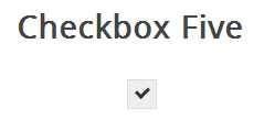
这个复选框的样式有些不同,它看起来只是比浏览器默认的checkbox样式稍微好了些,但是不同的是我们可以根据自己的需要来定义它的样式了。
首先还是一样的HTML代码
在前面的例子中,我们把div作为checkbox的滑动条带或者外部的圆圈,但是这一次我们不需要了,可以使用div元素来设置复选框的区域。
            /*
            *
 * Checkbox Five

            */

.checkboxFive {
    width: 25px;
    margin: 20px 100px;
    position: relative;
}
label标签用于Click事件和我们要定义的复选框的方框样式。
            /*
            *
 * Create the box for the checkbox

            */

.checkboxFive label {
    cursor: pointer;
    position: absolute;
    width: 25px;
    height: 25px;
    top: 0;
    left: 0;
    background: #eee;
    border:1px solid #ddd;
}
接下来,我们要创建方框中的对勾,对于这一点,我们可以使用:after伪类创建一个新的元素,为了实现这个样式,我们可以创建一个5px x 9px的长方形并给他加上边框。这时候我们去掉上面和右边的边框之后,它会看起来像一个字母L。然后我们可以使用CSS的transform属性让它旋转 一下,这样看起来就像是一个对勾。
            /*
            *
 * Display the tick inside the checkbox

            */

.checkboxFive label:after {
    opacity: 0.2;
    content: ‘‘;
    position: absolute;
    width: 9px;
    height: 5px;
    background: transparent;
    top: 6px;
    left: 7px;
    border: 3px solid #333;
    border-top: none;
    border-right: none;

    -webkit-transform: rotate(-45deg);
    -moz-transform: rotate(-45deg);
    -o-transform: rotate(-45deg);
    -ms-transform: rotate(-45deg);
    transform: rotate(-45deg);
}
在上面的CSS中,我们已经设置它的透明度为0.2,所以你会看到的复选框有一个半透明的对勾。你可以在悬停的时候加深一点,在选中时,可以把设置为不透明。
            /*
            *
 * Create the hover event of the tick

            */

.checkboxFive label:hover::after {
    opacity: 0.5;
}

/**
 * Create the checkbox state for the tick
 */
.checkboxFive input[type=checkbox]:checked + label:after {
    opacity: 1;
}
这将会为你创建全新的checkbox复选框样式。
原文:http://www.cnblogs.com/CheeseZH/p/4580062.html
内容总结
以上是互联网集市为您收集整理的纯CSS自定义Html中Checkbox复选框样式全部内容,希望文章能够帮你解决纯CSS自定义Html中Checkbox复选框样式所遇到的程序开发问题。 如果觉得互联网集市技术教程内容还不错,欢迎将互联网集市网站推荐给程序员好友。
内容备注
版权声明:本文内容由互联网用户自发贡献,该文观点与技术仅代表作者本人。本站仅提供信息存储空间服务,不拥有所有权,不承担相关法律责任。如发现本站有涉嫌侵权/违法违规的内容, 请发送邮件至 gblab@vip.qq.com 举报,一经查实,本站将立刻删除。
内容手机端
扫描二维码推送至手机访问。