echarts系列-样式调整总结
内容导读
互联网集市收集整理的这篇技术教程文章主要介绍了echarts系列-样式调整总结,小编现在分享给大家,供广大互联网技能从业者学习和参考。文章包含4333字,纯文字阅读大概需要7分钟。
内容图文

1.饼图怎么调整左右位置
只需要调整option.series里的center: [‘30%‘, ‘50%‘]
        series : [
        {
            name: ‘访问来源‘,
            type: ‘pie‘,
            radius : ‘55%‘,
            center: [‘30%‘, ‘50%‘],  //  这个代码~~
            data:[
                {value:335, name:‘直接访问‘},
                {value:310, name:‘邮件营销‘},
                {value:234, name:‘联盟广告‘},
                {value:135, name:‘视频广告‘},
                {value:1548, name:‘搜索引擎‘}
            ],
            itemStyle: {
                emphasis: {
                    shadowBlur: 10,
                    shadowOffsetX: 0,
                    shadowColor: ‘rgba(0, 0, 0, 0.5)‘
                }
            }
        }
    ]
2.更改x轴样式,控制样式里的X轴字在中间, 距离Y轴还有点距离
        xAxis: {
      type: ‘category‘,
      axisTick: { alignWithLabel: true }, // 控制样式里的X轴字在中间距离Y轴还有点距离
      data: [‘5‘, ‘10‘, ‘15‘, ‘20‘, ‘25‘, ‘30‘],
    },
3.echarts将网格线设置成虚线
        yAxis: {
    splitLine :{    //网格线
        lineStyle:{
            type:‘dashed‘    //设置网格线类型 dotted:虚线   solid:实线
        },
        show:true //隐藏或显示
    }
}
4.x轴刻度居中
        option = {
    tooltip: {
      trigger: ‘axis‘,
      axisPointer: {
        // 坐标轴指示器,坐标轴触发有效
        type: ‘shadow‘,
        // 默认为直线,可选为:‘line‘ | ‘shadow‘
      },
    },
    toolbox: {
        show: true,
        feature: {
            dataView: {readOnly: false},
            restore: {},
            saveAsImage: {}
        }
    },
    grid: { top: ‘12%‘, left: ‘3%‘, right: ‘4%‘, bottom: ‘3%‘, containLabel: true },
    xAxis: [
      {
        type: ‘category‘,
        data: [‘8:30‘, ‘9:30‘, ‘10:30‘, ‘11:30‘, ‘12:30‘, ‘13:30‘, ‘14:30‘, ‘15:30‘, ‘16:30‘, ‘17:30‘, ‘18:30‘, ‘19:30‘, ‘20:30‘],
        axisTick: { alignWithLabel: true }, // 刻度居中核心代码
        axisLabel: {
          textStyle: {
            // color: ‘black‘, // 修改X轴文字的颜色
            fontSize: ‘9‘, // 修改X轴文字大小
          }
        },
      },
    ],
    // xAxis: [
    //   {
    //     data: [100, 80, 50, 120, 120, 30, 100, 100, 80, 50, 120, 120, 30, 100],
    //     show: false,
    //   },
    //   {
    //     data: [‘8:30‘, ‘9:30‘, ‘10:30‘, ‘11:30‘, ‘12:30‘, ‘13:30‘, ‘14:30‘, ‘15:30‘, ‘16:30‘, ‘17:30‘, ‘18:30‘, ‘19:30‘, ‘20:30‘, ‘21:30‘],
    //     position: ‘bottom‘,
    //     boundaryGap: false,
    //     axisPointer: {
    //       show: false,
    //     },
    //     nameTextStyle: {
    //       color: ‘#999‘,
    //     },
    //     axisLine: {
    //       show: false,
    //     },
    //     axisTick: {
    //       show: false,
    //     },
    //     axisLabel: {
    //       // interval: 0,
    //       // color: ‘#999999‘,
    //       textStyle: {
    //         color: ‘red‘, // 修改X轴文字的颜色
    //         fontSize: ‘9‘, // 修改X轴文字大小
    //       }
    //     },
    //     // splitLine: { // 背景竖着的刻度线
    //     //     show: true,
    //     //     lineStyle: {
    //     //         color: ‘#F1F1F1‘,
    //     //     },
    //     // },
    //   },
    // ],
    yAxis: [{
      type: ‘value‘,
      splitLine: {    //网格线
        lineStyle: {
          type: ‘dashed‘    //设置网格线类型 dotted:虚线   solid:实线
        },
        show: true //隐藏或显示
      }
    }],
    series: [{
      name: ‘直接访问‘, type: ‘bar‘, barWidth: ‘60%‘, data: [100, 80, 50, 120, 120, 30, 100, 100, 80, 50, 120, 120, 30, 100],

      itemStyle: {
        normal: {
          //这里是重点
          color: function (params) {
            // var colorList = [‘#c23531‘, ‘#2f4554‘, ‘#61a0a8‘, ‘#d48265‘, ‘#91c7ae‘, ‘#749f83‘, ‘#ca8622‘];
            // return colorList[params.dataIndex]
            return ‘#0eb30e‘
          }
        }
      }
    }],
  }
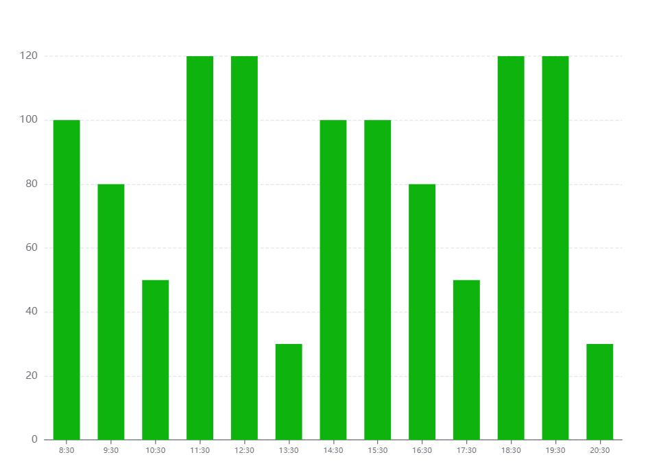
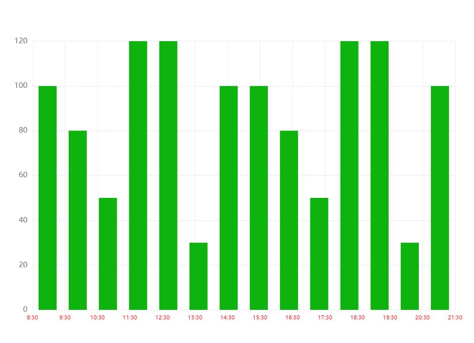
5.echarts X轴区间柱形图,X轴 刻度数组长度 比 数据数组长度 多一个
        option = {
    tooltip: {
      trigger: ‘axis‘,
      axisPointer: {
        // 坐标轴指示器,坐标轴触发有效
        type: ‘shadow‘,
        // 默认为直线,可选为:‘line‘ | ‘shadow‘
      },
    },
    toolbox: {
        show: true,
        feature: {
            dataView: {readOnly: false},
            restore: {},
            saveAsImage: {}
        }
    },
    grid: { top: ‘12%‘, left: ‘3%‘, right: ‘4%‘, bottom: ‘3%‘, containLabel: true },
    // xAxis: [
    //   {
    //     type: ‘category‘,
    //     data: [‘8:30‘, ‘9:30‘, ‘10:30‘, ‘11:30‘, ‘12:30‘, ‘13:30‘, ‘14:30‘, ‘15:30‘, ‘16:30‘, ‘17:30‘, ‘18:30‘, ‘19:30‘, ‘20:30‘],
    //     axisTick: { alignWithLabel: true }, // 刻度居中核心代码
    //     axisLabel: {
    //       textStyle: {
    //         // color: ‘black‘, // 修改X轴文字的颜色
    //         fontSize: ‘9‘, // 修改X轴文字大小
    //       }
    //     },
    //   },
    // ],
    xAxis: [  // 核心代码--双x轴刻度
      {
        data: [100, 80, 50, 120, 120, 30, 100, 100, 80, 50, 120, 120, 30, 100],
        show: false,
      },
      {
        data: [‘8:30‘, ‘9:30‘, ‘10:30‘, ‘11:30‘, ‘12:30‘, ‘13:30‘, ‘14:30‘, ‘15:30‘, ‘16:30‘, ‘17:30‘, ‘18:30‘, ‘19:30‘, ‘20:30‘, ‘21:30‘],
        position: ‘bottom‘,
        boundaryGap: false,
        axisPointer: {
          show: false,
        },
        nameTextStyle: {
          color: ‘#999‘,
        },
        axisLine: {
          show: false,
        },
        axisTick: {
          show: false,
        },
        axisLabel: {
          // interval: 0,
          // color: ‘#999999‘,
          textStyle: {
            color: ‘red‘, // 修改X轴文字的颜色
            fontSize: ‘9‘, // 修改X轴文字大小
          }
        },
        splitLine: { // 背景竖着的刻度线
            show: true,
            lineStyle: {
                color: ‘#F1F1F1‘,
            },
        },
      },
    ],
    yAxis: [{
      type: ‘value‘,
      splitLine: {    //网格线
        lineStyle: {
          type: ‘dashed‘    //设置网格线类型 dotted:虚线   solid:实线
        },
        show: true //隐藏或显示
      }
    }],
    series: [{
      name: ‘直接访问‘, type: ‘bar‘, barWidth: ‘60%‘, data: [100, 80, 50, 120, 120, 30, 100, 100, 80, 50, 120, 120, 30, 100],

      itemStyle: {
        normal: {
          //这里是重点
          color: function (params) {
            // var colorList = [‘#c23531‘, ‘#2f4554‘, ‘#61a0a8‘, ‘#d48265‘, ‘#91c7ae‘, ‘#749f83‘, ‘#ca8622‘];
            // return colorList[params.dataIndex]
            return ‘#0eb30e‘
          }
        }
      }
    }],
  }
原文:https://www.cnblogs.com/sugartang/p/14899508.html
内容总结
以上是互联网集市为您收集整理的echarts系列-样式调整总结全部内容,希望文章能够帮你解决echarts系列-样式调整总结所遇到的程序开发问题。 如果觉得互联网集市技术教程内容还不错,欢迎将互联网集市网站推荐给程序员好友。
内容备注
版权声明:本文内容由互联网用户自发贡献,该文观点与技术仅代表作者本人。本站仅提供信息存储空间服务,不拥有所有权,不承担相关法律责任。如发现本站有涉嫌侵权/违法违规的内容, 请发送邮件至 gblab@vip.qq.com 举报,一经查实,本站将立刻删除。
内容手机端
扫描二维码推送至手机访问。
来源:【匿名】