《图解CSS3——第3章 CSS3边框-4》
内容导读
互联网集市收集整理的这篇技术教程文章主要介绍了《图解CSS3——第3章 CSS3边框-4》,小编现在分享给大家,供广大互联网技能从业者学习和参考。文章包含9639字,纯文字阅读大概需要14分钟。
内容图文

3.4 CSS3圆角边框属性
在web页面上圆角效果很常见。圆角给页面增添曲线之美,让页面不那么生硬,但是为了设计圆角效果。
3.4.1 broder-radius 属性的语法及参数
语法:
border-radius : none | <length>{1,4} [/ <length>{1,4} ]?
border-radius是一种缩写方法。如果“/”前后的值都存在,那么“/”前面的值设置其水平半径,“/”后面值设置其垂直半径。如果没有“/”,则水平和垂直半径相等。另外其四个值是按照top-left、top-right、bottom-right、bottom-left的顺序来设置的其主要会有下面几种情形出现:
1、border-radius: [ <length>{1,4} ]; //这里只有一个值,那么top-left、top-right、bottom-right、bottom-left四个值相等。
2、border-radius:[ <length>{1,4} ] [ <length>{1,4} ]; //这里设置两个值,那么top-left等于bottom-right,并且取第一个值;top-right等于bottom-left,并且取第二个值。
3、border-radius:[ <length>{1,4} ] [ <length>{1,4} ] [ <length>{1,4} ];//如果有三个值,其中第一个值是设置top-left;而第二个值是top-right和bottom-left并且他们会相等,第三个值是设置bottom-right。
4、border-radius:[ <length>{1,4} ] [ <length>{1,4} ] [ <length>{1,4} ] [ <length>{1,4} ];//如果有四个值,其中第一个值是设置top-left;而第二个值是top-right,第三个值bottom-right,第四个值是设置bottom-left。
border-radius和border属性一样,还可以把各个角单独拆分出来,这样就派生出另外四个子属性,他们都是先Y轴在X轴,具体看下面:
        border-top-left-radius: <length>  <length>   //左上角
border-top-right-radius: <length>  <length>  //右上角
border-bottom-right-radius:<length>  <length>  //右下角
border-bottom-left-radius:<length>  <length>   //左下角
各角拆分出来取值方式:中第一个值是圆角水平半径,第二个值是垂直半径,如果第二个值省略,那么其等于第一个值,这时这个角就是一个四分之一的圆角,如果任意一个值为0,那么这个角就不是圆角。
3.4.2 border-radius 属性使用方法
1、水平和垂直半径一样
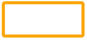
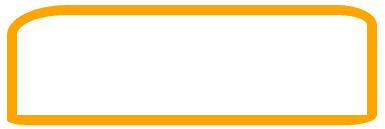
1)border-radius 只设置一个值
        <!DOCTYPE html>
<html lang="en">
<head>
    <meta charset="UTF-8">
    <title>CSS3 的 border-radius 制作圆角</title>
    <style>
        .border-radius{
            width: 250px;
            height: 100px;
            border: 10px solid orange;
            border-radius: 10px;
        }
    </style>
</head>
<body>
    <div ></div>
</body>
</html>
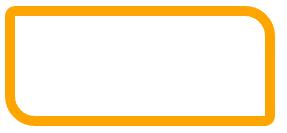
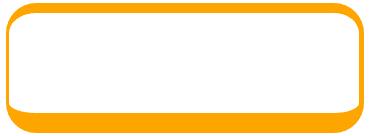
2)border-radius 设置两个值
        .border-radius{
    width: 250px;
    height: 100px;
    border: 10px solid orange;
    border-radius: 10px 30px;
}
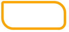
3)border-radius 设置三个值
        .border-radius{
    width: 250px;
    height: 100px;
    border: 10px solid orange;
    border-radius: 10px 50px 30px;
}
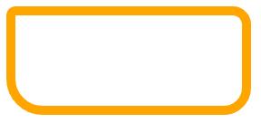
4)border-radius 设置四个值
        .border-radius{
    width: 250px;
    height: 100px;
    border: 10px solid orange;
    border-radius: 10px 20px 30px 40px;
}
2、单独设置水平和垂直半径值
        .border-radius{
    width: 350px;
    height: 100px;
    border: 10px solid orange;
    border-radius: 60px 40px 30px 20px / 30px 20px 10px 5px;
}
3、特殊应用
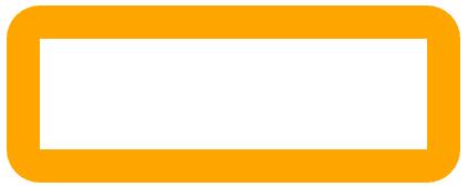
1)对于border-radius还有一个内半径和外半径的区别,它主要是元素 边框值较大时,效果就很明显,当我们border-radius半径值小于或等于border的厚度时,我们边框内部就不具有圆角效果
        .border-radius{
    width: 350px;
    height: 100px;
    border: 30px solid orange;
    border-radius: 30px;
}
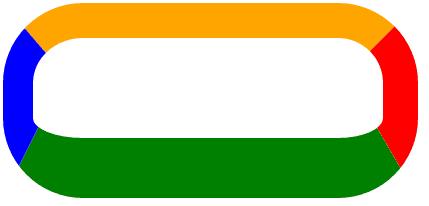
2)如果角的两个相邻边有不同的宽度,那么这个角将会从宽的边平滑过度到窄的边。其中一条边甚至可以是0。相邻转角是由大向小转。
        .border-radius{
    width: 350px;
    height: 100px;
    border-style: solid;
    border-color: orange;
    border-width: 10px 5px 20px 3px;
    border-radius: 30px;
}
        .border-radius{
    width: 350px;
    height: 100px;
    border-style: solid;
    border-color: orange red green blue;
    border-width: 35px 35px 60px 30px;
    border-radius: 80px;
}
4、图片应用圆角
        img {
    border: 5px solid red;
    border-radius: 10px;
}
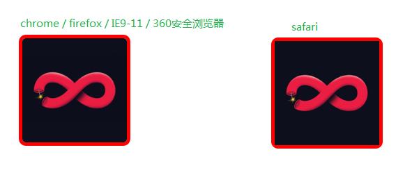
IE9-11均使用的IE11仿真模式查看,非原生
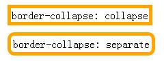
5、表格应用圆角
        <!DOCTYPE html>
<html lang="en">
<head>
    <meta charset="UTF-8">
    <title>表格的圆角应用</title>
    <style>
        table {
            margin: 10px;
            border: 5px solid orange;
            border-radius: 10px;
        }
        .table1 {
            border-collapse: collapse;
        }
        .table2 {
            border-collapse: separate;
        }
    </style>
</head>
<body>
    <table >
        <tr>
            <td>border-collapse: collapse</td>
        </tr>
    </table>
    <table >
        <tr>
            <td>border-collapse: separate</td>
        </tr>
    </table>
</body>
</html>
3.4.3 浏览器兼容性
主流浏览器均支持,IE9+支持。
3.4.4 border-radius 属性的优势
略
3.4.5 实战体验:制作特殊图形
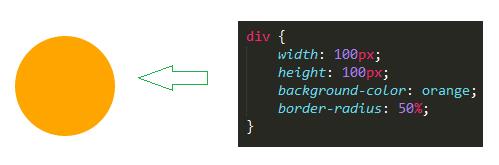
1、 圆形
border-radius制作圆角有两点技巧。 - 元素的宽度和高度相同 - 圆角的半径值为元素宽度或者宽度的一般或者直接设置圆角半径值为50%。
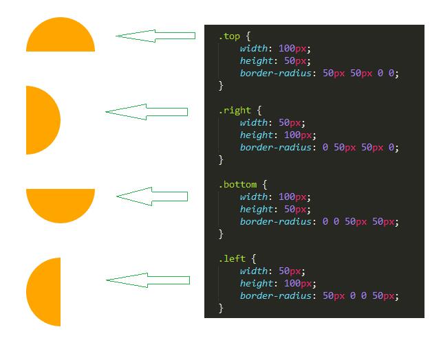
2、 半圆 border-radius制作半圆于制作圆形的方法是一样的,只是元素的宽度与圆角方向要配合一致,不同的宽度和高度比例,以及圆角方位,可以制作上半园、下半圆、左半圆、右半圆效果。
        <!DOCTYPE html>
<html lang="en">
<head>
    <meta charset="UTF-8">
    <title>半圆</title>
    <style>
        body{
            padding: 100px;
        }
        div {
            background-color: orange;
            margin: 50px;
        }
        .top {
            width: 100px;
            height: 50px;
            border-radius: 50px 50px 0 0;
        }
        .right {
            width: 50px;
            height: 100px;
            border-radius: 0 50px 50px 0;
        }
        .bottom {
            width: 100px;
            height: 50px;
            border-radius: 0 0 50px 50px;
        }
        .left {
            width: 50px;
            height: 100px;
            border-radius: 50px 0 0 50px;
        }
    </style>
</head>
<body>
    <div ></div>
    <div ></div>
    <div ></div>
    <div ></div>
</body>
</html>
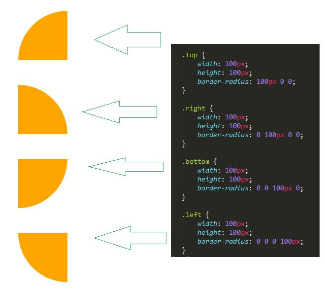
3、扇形
        <!DOCTYPE html>
<html lang="en">
<head>
    <meta charset="UTF-8">
    <title>扇形</title>
    <style>
        body{
            padding: 100px;
        }
        div {
            background-color: orange;
            margin: 50px;
        }
        .top {
            width: 100px;
            height: 100px;
            border-radius: 100px 0 0;
        }
        .right {
            width: 100px;
            height: 100px;
            border-radius: 0 100px 0 0;
        }
        .bottom {
            width: 100px;
            height: 100px;
            border-radius: 0 0 100px 0;
        }
        .left {
            width: 100px;
            height: 100px;
            border-radius: 0 0 0 100px;
        }
    </style>
</head>
<body>
    <div ></div>
    <div ></div>
    <div ></div>
    <div ></div>
</body>
</html>
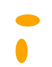
4、 椭圆
        <!DOCTYPE html>
<html lang="en">
<head>
    <meta charset="UTF-8">
    <title>椭圆</title>
    <style>
        body{
            padding: 100px;
        }
        div {
            background-color: orange;
            margin: 50px;
        }
        .hov {
            width: 100px;
            height: 50px;
            border-radius: 100px / 50px;
        }
        .ver {
            width: 50px;
            height: 100px;
            border-radius: 50px / 100px;
        }
    </style>
</head>
<body>
    <div ></div>
    <div ></div>
</body>
</html>
原文:http://www.cnblogs.com/baixc/p/6166333.html
内容总结
以上是互联网集市为您收集整理的《图解CSS3——第3章 CSS3边框-4》全部内容,希望文章能够帮你解决《图解CSS3——第3章 CSS3边框-4》所遇到的程序开发问题。 如果觉得互联网集市技术教程内容还不错,欢迎将互联网集市网站推荐给程序员好友。
内容备注
版权声明:本文内容由互联网用户自发贡献,该文观点与技术仅代表作者本人。本站仅提供信息存储空间服务,不拥有所有权,不承担相关法律责任。如发现本站有涉嫌侵权/违法违规的内容, 请发送邮件至 gblab@vip.qq.com 举报,一经查实,本站将立刻删除。
内容手机端
扫描二维码推送至手机访问。