首页 / VUE / vue封装圆形菜单(冒泡菜单)组件
vue封装圆形菜单(冒泡菜单)组件
内容导读
互联网集市收集整理的这篇技术教程文章主要介绍了vue封装圆形菜单(冒泡菜单)组件,小编现在分享给大家,供广大互联网技能从业者学习和参考。文章包含13925字,纯文字阅读大概需要20分钟。
内容图文
组件")
参考地址:https://www.html5tricks.com/html5-css3-circle-menu.html
二、参考
上面有一个链接地址,我参考了这个插件的源码,没有做太多的改变,只是修改为了适合我当前的需求,并且把步骤和思路大概整理了一下。
因为我本人是个前端小白,对于美仅限于欣赏。
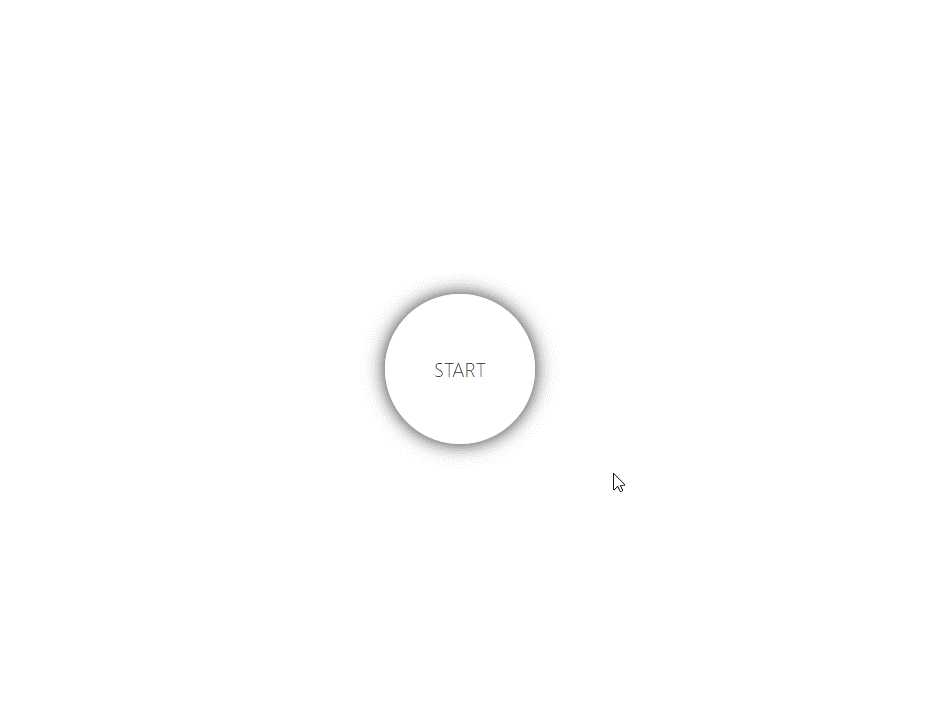
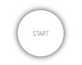
三、第一步
首先构建一个样子出来。
                    <
                    template
                    >
                    <
                    div
                    class
                    ="wrapper"
                    >
                    <
                    a
                    href
                    ="#"
                     class
                    ="show"
                    >START</a><ul><!-- 一级列表 --><li><a href="#">A</a><!-- 二级列表 --><ul><li><a href="#">A-1</a></li><li><a href="#">A-2</a></li><li><a href="#">A-3</a></li><li><a href="#">A-4</a></li><li><a href="#">A-5</a></li></ul></li><li><a href="#">B</a><ul><li><a href="#">B-1</a></li><li><a href="#">B-2</a></li><li><a href="#">B-3</a></li><li><a href="#">B-4</a></li><li><a href="#">B-5</a></li></ul></li></ul></div></template>
                    <style scoped>
ul{
    list-style: none;
}
a {
  width: 120px;
  height: 120px;
  position: absolute;
  background: rgba(255, 255, 255, 0.9);
  text-align: center;
  text-decoration: none;
  align-items: center;
  justify-content: center;
  border-radius: 120px;
  display: none; /*默认所有的a都不显示*/
  text-decoration: none;
  color: #333;
  transition: all 1s ease;
  box-shadow: 0 0 15px #222;
  font-family: "segoe ui";
  font-weight: 200;
  font-size: 16px;
}
.wrapper {
  width: 100%;
  height: 100%;
  display: flex;
  align-items: center;
  justify-content: center;
  position: absolute;
}
a.show {
  display: flex !important; /*因为开始设置了a标签为none,这里重置display可以让他显示*/
}
</style>

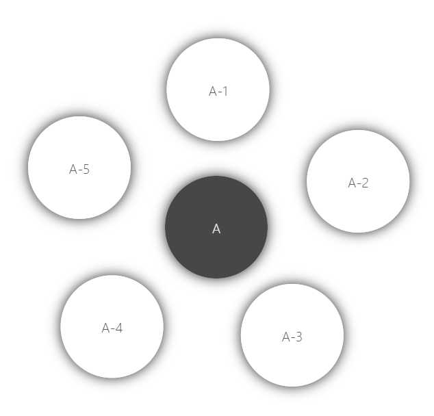
四、第二步
做环绕效果。
                    <
                    template
                    >
                    <
                    div
                    class
                    ="wrapper"
                    >
                    <
                    a
                    href
                    ="#"
                     class
                    =""
                    >START</a><ul><!-- 一级列表 --><li><a href="#" class="selected">A</a><!-- 二级列表 --><ul><li><a href="#">A-1</a></li><li><a href="#">A-2</a></li><li><a href="#">A-3</a></li><li><a href="#">A-4</a></li><li><a href="#">A-5</a></li></ul></li><li><a href="#">B</a><ul><li><a href="#">B-1</a></li><li><a href="#">B-2</a></li><li><a href="#">B-3</a></li><li><a href="#">B-4</a></li><li><a href="#">B-5</a></li></ul></li></ul></div></template>
                    <style scoped>
ul {
  list-style: none;
}
a {
  width: 120px;
  height: 120px;
  position: absolute;
  background: rgba(255, 255, 255, 0.9);
  text-align: center;
  text-decoration: none;
  align-items: center;
  justify-content: center;
  border-radius: 120px;
  display: none; /*默认所有的a都不显示*/
  text-decoration: none;
  color: #333;
  transition: all 1s ease;
  box-shadow: 0 0 15px #222;
  font-family: "segoe ui";
  font-weight: 200;
  font-size: 16px;
}
.wrapper {
  width: 100%;
  height: 100%;
  display: flex;
  align-items: center;
  justify-content: center;
  position: absolute;
}
a.show {
  display: flex !important; /*因为开始设置了a标签为none,这里重置display可以让他显示*/
}
/*对所有的li标签加动画效果*/
.wrapper li {
  -webkit-transform: translate3d(0, 0, 0); /*调用GPU提升动画性能*/
  transform: translate3d(0, 0, 0);
  transition: all 1s ease;
  /*下面的方法好像也可以提升性能,具体并没有比较*//* backface-visibility: hidden;
    perspective: 1000; */
}
/*设置选中样式*/
.selected {
  background: rgba(51, 51, 51, 0.9);
  display: flex;
  /*调整中心圆形的位置*/
  top: calc(50% - 50px);
  left: calc(50% - 60px);
  color: #f1f1f1;
  animation: light 1s infinite;
}
/*让当前选中的子集列表显示*/
.selected + ul > li > a {
    /*让当前选中的子选项显示,因为默认是 display:none*/
    display: flex;
}
/*设置 li 的位置,rotate是顺/逆时针旋转,translateX是沿x轴平移*/
.selected + ul > li:nth-child(1) {
    -webkit-transform: rotate(-120deg) translateX(80px);
    transform: rotate(-120deg) translateX(80px);
}
/*设置a标签内字体的位置,应为容器旋转后,字体倾斜了,需要调整回来*//*这里有一个小技巧:字体的旋转角度正好和外部容器的旋转角度相反,但是最后一个的位置需要调整*/
 .selected + ul > li:nth-child(1) > a {
    -webkit-transform: rotate(120deg);
    transform: rotate(120deg);
}

 .selected + ul > li:nth-child(2) {
    -webkit-transform: rotate(-40deg) translateX(80px);
    transform: rotate(-40deg) translateX(80px);
}
 .selected + ul > li:nth-child(2) > a {
    -webkit-transform: rotate(40deg);
    transform: rotate(40deg);
}

 .selected + ul > li:nth-child(3) {
    -webkit-transform: rotate(40deg) translateX(80px);
    transform: rotate(40deg) translateX(80px);
}
 .selected + ul > li:nth-child(3) > a {
    -webkit-transform: rotate(-40deg);
    transform: rotate(-40deg);
}

 .selected + ul > li:nth-child(4) {
    -webkit-transform: rotate(120deg) translateX(120px);
    transform: rotate(120deg) translateX(120px);
}
 .selected + ul > li:nth-child(4) > a {
    -webkit-transform: rotate(-120deg);
    transform: rotate(-120deg);
}
 .selected + ul > li:nth-child(5) {
    -webkit-transform: rotate(180deg) translateX(120px);
    transform: rotate(180deg) translateX(120px);
}
 .selected + ul > li:nth-child(5) > a {
    -webkit-transform: rotate(180deg);
    transform: rotate(180deg);
}
</style>

五、第三步
加动画,以及实现级联。
                    <
                    template
                    >
                    <
                    div
                    class
                    ="wrapper"
                    >
                    <
                    a
                    href
                    ="#"
                     class
                    ="show"
                     @click
                    ="Bubblings($event)"
                    >START</a><ul><!-- 一级列表 --><li><a href="#" @click="Bubblings($event)">A</a><!-- 二级列表 --><ul><li><a href="#" @click="Bubblings($event)">A-1</a></li><li><a href="#" @click="Bubblings($event)">A-2</a></li><li><a href="#" @click="Bubblings($event)">A-3</a></li><li><a href="#" @click="Bubblings($event)">A-4</a></li><li><a href="#" @click="Bubblings($event)">A-5</a></li></ul></li><li><a href="#" @click="Bubblings($event)">B</a><ul><li><a href="#" @click="Bubblings($event)">B-1</a></li><li><a href="#" @click="Bubblings($event)">B-2</a></li><li><a href="#" @click="Bubblings($event)">B-3</a></li><li><a href="#" @click="Bubblings($event)">B-4</a></li><li><a href="#" @click="Bubblings($event)">B-5</a></li></ul></li></ul></div></template>
<script>
export default {
    name:‘bubbling‘,
    methods:{
        Bubblings(e){
            //获取点击的DOM对象
            let self = e.target
            //检查点击的是否是选中的圆if (self.classList.contains(‘selected‘)) {
                //如果是移除当前选中效果,返回上级菜单
                self.classList.remove(‘selected‘)
                //判断它的父级元素是不是顶级元素if (!self.parentNode.classList.contains(‘wrapper‘)) {
                    //如果不是顶级元素,展示对应的菜单列表                    self.parentNode.parentNode.parentNode
                        .querySelector(‘a‘)
                        .classList.add(‘selected‘)
                } else {
                    //如果是顶级元素,仅显示最顶级元素
                    self.classList.add(‘show‘)
                }
            } else {
                //如果点击的不是选中的圆
                self.classList.add(‘selected‘)
                //判断是否点击的是顶级元素if (!self.parentNode.classList.contains(‘wrapper‘)) {
                    //如果不是顶级元素,展开所点击的菜单列表// a(self) -> li(parent) -> ul(parent) -> li(parent) -> a(target)                    self.parentNode.parentNode.parentNode
                        .querySelector(‘a‘)
                        .classList.remove(‘selected‘)
                } else {
                    //点击顶级元素展开一级菜单列表
                    self.classList.remove(‘show‘)
                }
            }
            returnfalse
        }
    }
}
</script>
                    <style scoped>
ul {
  list-style: none;
}
a {
  width: 120px;
  height: 120px;
  position: absolute;
  background: rgba(255, 255, 255, 0.9);
  text-align: center;
  text-decoration: none;
  align-items: center;
  justify-content: center;
  border-radius: 120px;
  display: none; /*默认所有的a都不显示*/
  text-decoration: none;
  color: #333;
  transition: all 1s ease;
  box-shadow: 0 0 15px #222;
  font-family: "segoe ui";
  font-weight: 200;
  font-size: 16px;
}
.wrapper {
  width: 100%;
  height: 100%;
  display: flex;
  align-items: center;
  justify-content: center;
  position: absolute;
}
a.show {
  display: flex !important; /*因为开始设置了a标签为none,这里重置display可以让他显示*/
}
/*对所有的li标签加动画效果*/
.wrapper li {
  -webkit-transform: translate3d(0, 0, 0); /*调用GPU提升动画性能*/
  transform: translate3d(0, 0, 0);
  transition: all 1s ease;
  /*下面的方法好像也可以提升性能,具体并没有比较*//* backface-visibility: hidden;
    perspective: 1000; */
}
/*设置选中样式*/
.selected {
  background: rgba(51, 51, 51, 0.9);
  display: flex;
  /*调整中心圆形的位置*/
  top: calc(50% - 50px);
  left: calc(50% - 60px);
  color: #f1f1f1;
  animation: light 1s infinite;
}
/*让当前选中的子集列表显示*/
.selected + ul > li > a {
  /*让当前选中的子选项显示,因为默认是 display:none*/
  display: flex;
}
/*设置 li 的位置,rotate是顺/逆时针旋转,translateX是沿x轴平移*/
.selected + ul > li:nth-child(1) {
  -webkit-transform: rotate(-120deg) translateX(80px);
  transform: rotate(-120deg) translateX(80px);
}
/*设置a标签内字体的位置,应为容器旋转后,字体倾斜了,需要调整回来*//*这里有一个小技巧:字体的旋转角度正好和外部容器的旋转角度相反,但是最后一个的位置需要调整*/
.selected + ul > li:nth-child(1) > a {
  -webkit-transform: rotate(120deg);
  transform: rotate(120deg);
}

.selected + ul > li:nth-child(2) {
  -webkit-transform: rotate(-40deg) translateX(80px);
  transform: rotate(-40deg) translateX(80px);
}
.selected + ul > li:nth-child(2) > a {
  -webkit-transform: rotate(40deg);
  transform: rotate(40deg);
}

.selected + ul > li:nth-child(3) {
  -webkit-transform: rotate(40deg) translateX(80px);
  transform: rotate(40deg) translateX(80px);
}
.selected + ul > li:nth-child(3) > a {
  -webkit-transform: rotate(-40deg);
  transform: rotate(-40deg);
}

.selected + ul > li:nth-child(4) {
  -webkit-transform: rotate(120deg) translateX(120px);
  transform: rotate(120deg) translateX(120px);
}
.selected + ul > li:nth-child(4) > a {
  -webkit-transform: rotate(-120deg);
  transform: rotate(-120deg);
}
.selected + ul > li:nth-child(5) {
  -webkit-transform: rotate(180deg) translateX(120px);
  transform: rotate(180deg) translateX(120px);
}
.selected + ul > li:nth-child(5) > a {
  -webkit-transform: rotate(180deg);
  transform: rotate(180deg);
}
</style>
六、第四步
绑定数据,以及完整代码。
                <
                template
                >
                <
                div
                class
                ="wrapper"
                >
                <
                a
                href
                ="#"
                 class
                ="show"
                 @click
                ="Bubblings($event)"
                >START</a><ul><!-- 一级列表 --><li v-for="(item,index) of list" :key="index"><a href="#" @click="Bubblings($event)">{{ item.name }}</a><!-- 二级列表 --><ul><li v-for="(child,index) of item.childs" :key="index"><a href="#" @click="Bubblings($event)">{{ child.name }}</a></li></ul></li></ul></div></template>
<script>
export default {
    name:‘bubbling‘,
    data(){
        return {
            list:[
                {
                    name:‘A‘,
                    childs:[
                        {
                            name:‘A-1‘
                        },
                        {
                            name:‘A-2‘
                        },
                        {
                            name:‘A-3‘
                        }
                    ]
                },
                {
                    name:‘B‘,
                    childs:[
                        {
                            name:‘B-1‘
                        },
                        {
                            name:‘B-2‘
                        },
                        {
                            name:‘B-3‘
                        }
                    ]
                }
            ]
        }
    },
    methods:{
        Bubblings(e){
            //获取点击的DOM对象
            let self = e.target
            //检查点击的是否是选中的圆if (self.classList.contains(‘selected‘)) {
                //如果是移除当前选中效果,返回上级菜单
                self.classList.remove(‘selected‘)
                //判断它的父级元素是不是顶级元素if (!self.parentNode.classList.contains(‘wrapper‘)) {
                    //如果不是顶级元素,展示对应的菜单列表                    self.parentNode.parentNode.parentNode
                        .querySelector(‘a‘)
                        .classList.add(‘selected‘)
                } else {
                    //如果是顶级元素,仅显示最顶级元素
                    self.classList.add(‘show‘)
                }
            } else {
                //如果点击的不是选中的圆
                self.classList.add(‘selected‘)
                //判断是否点击的是顶级元素if (!self.parentNode.classList.contains(‘wrapper‘)) {
                    //如果不是顶级元素,展开所点击的菜单列表// a(self) -> li(parent) -> ul(parent) -> li(parent) -> a(target)                    self.parentNode.parentNode.parentNode
                        .querySelector(‘a‘)
                        .classList.remove(‘selected‘)
                } else {
                    //点击顶级元素展开一级菜单列表
                    self.classList.remove(‘show‘)
                }
            }
            returnfalse
        }
    }
}
</script>
                <style scoped>
ul {
  list-style: none;
}
a {
  width: 120px;
  height: 120px;
  position: absolute;
  background: rgba(255, 255, 255, 0.9);
  text-align: center;
  text-decoration: none;
  align-items: center;
  justify-content: center;
  border-radius: 120px;
  display: none; /*默认所有的a都不显示*/
  text-decoration: none;
  color: #333;
  transition: all 1s ease;
  box-shadow: 0 0 15px #222;
  font-family: "segoe ui";
  font-weight: 200;
  font-size: 16px;
}
.wrapper {
  width: 100%;
  height: 100%;
  display: flex;
  align-items: center;
  justify-content: center;
  position: absolute;
}
a.show {
  display: flex !important; /*因为开始设置了a标签为none,这里重置display可以让他显示*/
}
/*对所有的li标签加动画效果*/
.wrapper li {
  -webkit-transform: translate3d(0, 0, 0); /*调用GPU提升动画性能*/
  transform: translate3d(0, 0, 0);
  transition: all 1s ease;
  /*下面的方法好像也可以提升性能,具体并没有比较*//* backface-visibility: hidden;
    perspective: 1000; */
}
/*设置选中样式*/
.selected {
  background: rgba(51, 51, 51, 0.9);
  display: flex;
  /*调整中心圆形的位置*/
  top: calc(50% - 50px);
  left: calc(50% - 60px);
  color: #f1f1f1;
  animation: light 1s infinite;
}
/*让当前选中的子集列表显示*/
.selected + ul > li > a {
  /*让当前选中的子选项显示,因为默认是 display:none*/
  display: flex;
}
/*设置 li 的位置,rotate是顺/逆时针旋转,translateX是沿x轴平移*/
.selected + ul > li:nth-child(1) {
  -webkit-transform: rotate(-120deg) translateX(80px);
  transform: rotate(-120deg) translateX(80px);
}
/*设置a标签内字体的位置,应为容器旋转后,字体倾斜了,需要调整回来*//*这里有一个小技巧:字体的旋转角度正好和外部容器的旋转角度相反,但是最后一个的位置需要调整*/
.selected + ul > li:nth-child(1) > a {
  -webkit-transform: rotate(120deg);
  transform: rotate(120deg);
}

.selected + ul > li:nth-child(2) {
  -webkit-transform: rotate(-40deg) translateX(80px);
  transform: rotate(-40deg) translateX(80px);
}
.selected + ul > li:nth-child(2) > a {
  -webkit-transform: rotate(40deg);
  transform: rotate(40deg);
}

.selected + ul > li:nth-child(3) {
  -webkit-transform: rotate(40deg) translateX(80px);
  transform: rotate(40deg) translateX(80px);
}
.selected + ul > li:nth-child(3) > a {
  -webkit-transform: rotate(-40deg);
  transform: rotate(-40deg);
}

.selected + ul > li:nth-child(4) {
  -webkit-transform: rotate(120deg) translateX(120px);
  transform: rotate(120deg) translateX(120px);
}
.selected + ul > li:nth-child(4) > a {
  -webkit-transform: rotate(-120deg);
  transform: rotate(-120deg);
}
.selected + ul > li:nth-child(5) {
  -webkit-transform: rotate(180deg) translateX(120px);
  transform: rotate(180deg) translateX(120px);
}
.selected + ul > li:nth-child(5) > a {
  -webkit-transform: rotate(180deg);
  transform: rotate(180deg);
}
</style>
七、总结
更多的是对CSS动画的操作,以及DOM的结构和布局。欢迎留言讨论。
谦良恭卑,信诚实至;生活不易,共勉同求。
原文:https://www.cnblogs.com/elsonww/p/11494763.html
内容总结
以上是互联网集市为您收集整理的vue封装圆形菜单(冒泡菜单)组件全部内容,希望文章能够帮你解决vue封装圆形菜单(冒泡菜单)组件所遇到的程序开发问题。 如果觉得互联网集市技术教程内容还不错,欢迎将互联网集市网站推荐给程序员好友。
内容备注
版权声明:本文内容由互联网用户自发贡献,该文观点与技术仅代表作者本人。本站仅提供信息存储空间服务,不拥有所有权,不承担相关法律责任。如发现本站有涉嫌侵权/违法违规的内容, 请发送邮件至 gblab@vip.qq.com 举报,一经查实,本站将立刻删除。
内容手机端
扫描二维码推送至手机访问。