CSS3动画 animation (简单小时钟)
内容导读
互联网集市收集整理的这篇技术教程文章主要介绍了CSS3动画 animation (简单小时钟),小编现在分享给大家,供广大互联网技能从业者学习和参考。文章包含4041字,纯文字阅读大概需要6分钟。
内容图文
")
CSS3动画 添加某种效果可以从一种样式转变到另一个
-
@keyframes 创建动画 @keyframes move { 0% { transform: rotate(0deg); } 100% { transform: rotate(360deg); } }
-
animation 所有动画属性的简写属性,除了 animation-play-state 属性。
-
animation-name 规定 @keyframes 动画的名称。
-
animation-duration 规定动画完成一个周期所花费的秒或毫秒。默认是 0。
-
animation-timing-function 规定动画的速度曲线。默认是 "ease"。
-
animation-fill-mode 定当动画不播放时(当动画完成时,或当动画有一个延迟未开始播放时),要应用到元素的样式。
-
animation-delay 规定动画何时开始。默认是 0。
-
animation-iteration-count 规定动画被播放的次数。默认是 1。
-
animation-direction 规定动画是否在下一周期逆向地播放。默认是 "normal"。
-
animation-play-state 规定动画是否正在运行或暂停。默认是 "running"。
简单小时钟
              1 <!DOCTYPE html>
  2 <html lang="en">
  3  4 <head>
  5     <meta charset="UTF-8">
  6     <meta name="viewport" content="width=device-width, initial-scale=1.0">
  7     <title>钟表</title>
  8     <style>
  9/* 最外层表盘 */ 10        .outer {
 11            width: 250px;
 12            height: 250px;
 13            border: 10px solid gray;
 14            margin: 100px auto;
 15             border-radius: 50%;
 16            position: relative;
 17             text-align: center;
 18             line-height: 250px;
 19             z-index: 1;
 20        }
 21 22/* 内部时间刻度 */ 23        .bar {
 24            width: 10px;
 25            height: 250px;
 26             background-color: gray;
 27            position: absolute;
 28            left: 120px;
 29             background-color: hotpink;
 30        }
 31 32         .outer div:nth-child(1) {
 33             background-color: indianred;
 34        }
 35 36         .outer div:nth-child(2) {
 37            transform: rotate(30deg);
 38        }
 39 40         .outer div:nth-child(3) {
 41            transform: rotate(60deg);
 42        }
 43 44         .outer div:nth-child(4) {
 45            transform: rotate(90deg);
 46             background-color: indianred;
 47        }
 48 49         .outer div:nth-child(5) {
 50            transform: rotate(120deg);
 51        }
 52 53         .outer div:nth-child(6) {
 54            transform: rotate(150deg);
 55        }
 56 57/* 中间表盘,主要用来遮盖多余的时间刻度 */ 58        .inner {
 59            width: 230px;
 60            height: 230px;
 61             background-color: white;
 62             border-radius: 50%;
 63            position: absolute;
 64             z-index: 2;
 65            top: 10px;
 66            left: 10px;
 67        }
 68 69/* 中心的小点,旋转中心 */ 70        .center {
 71            width: 20px;
 72            height: 20px;
 73             background-color: tomato;
 74             border-radius: 50px;
 75/* 定位在最上边 */ 76            position: absolute;
 77             z-index: 10;
 78            top: 115px;
 79            left: 115px;
 80        }
 81 82/* 时针 */ 83        .hours {
 84            width: 8px;
 85            height: 50px;
 86             background-color: red;
 87             border-radius: 50%;
 88/* 定位 */ 89            position: absolute;
 90             z-index: 3;
 91            top: 75px;
 92            left: 121px;
 93/* 旋转 */ 94             transform-origin: bottom;
 95            animation: move 216000s;
 96             animation-timing-function: linear;
 97             animation-iteration-count: infinite;
 98        }
 99100/* 分针 */101        .minutes {
102            width: 5px;
103            height: 80px;
104             background-color: green;
105             border-radius: 50%;
106/* 定位 */107            position: absolute;
108             z-index: 4;
109            top: 45px;
110             left: 122.5px;
111/* 旋转 */112             transform-origin: bottom;
113            animation: move 3600s;
114             animation-timing-function: linear;
115             animation-iteration-count: infinite;
116        }
117118/* 秒针 */119        .seconds {
120            width: 3px;
121            height: 100px;
122             background-color: blue;
123             border-radius: 50%;
124/* 定位 */125            position: absolute;
126             z-index: 5;
127            top: 27px;
128            left: 123px;
129/* 旋转 */130             transform-origin: bottom;
131            animation: move 60s;
132             animation-timing-function: linear;
133             animation-iteration-count: infinite;
134        }
135136/* 旋转360°动画 */137        @keyframes move {
138             0% {
139                transform: rotate(0deg);
140            }
141142             100% {
143                transform: rotate(360deg);
144            }
145        }
146     </style>
147 </head>
148149 <body>
150     <!-- 容器 -->
151     <div class="outer">
152         <!-- 时间刻度 -->
153         <div class="bar"></div>
154         <div class="bar"></div>
155         <div class="bar"></div>
156         <div class="bar"></div>
157         <div class="bar"></div>
158         <div class="bar"></div>
159         <!-- 中间表盘,遮盖多余刻度 -->
160         <div class="inner"></div>
161         <!-- 中间旋转中心 -->
162         <div class="center"></div>
163         <!-- 时针 -->
164         <div class="hours"></div>
165         <!-- 分针 -->
166         <div class="minutes"></div>
167         <!-- 秒针 -->
168         <div class="seconds"></div>
169     </div>
170 </body>
171172 </html>
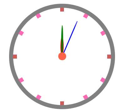
运行截图
原文:https://www.cnblogs.com/hjcby/p/13544230.html
内容总结
以上是互联网集市为您收集整理的CSS3动画 animation (简单小时钟)全部内容,希望文章能够帮你解决CSS3动画 animation (简单小时钟)所遇到的程序开发问题。 如果觉得互联网集市技术教程内容还不错,欢迎将互联网集市网站推荐给程序员好友。
内容备注
版权声明:本文内容由互联网用户自发贡献,该文观点与技术仅代表作者本人。本站仅提供信息存储空间服务,不拥有所有权,不承担相关法律责任。如发现本站有涉嫌侵权/违法违规的内容, 请发送邮件至 gblab@vip.qq.com 举报,一经查实,本站将立刻删除。
内容手机端
扫描二维码推送至手机访问。
来源:【匿名】