首页 / CSS / CSS自适应布局详解
CSS自适应布局详解
内容导读
互联网集市收集整理的这篇技术教程文章主要介绍了CSS自适应布局详解,小编现在分享给大家,供广大互联网技能从业者学习和参考。文章包含3091字,纯文字阅读大概需要5分钟。
内容图文
 这次给大家带来CSS自适应布局详解,CSS自适应布局的注意事项有哪些,下面就是实战案例,一起来看一下。
前言
本篇文章将介页面布局中的自适应布局,常见的自适应布局有以下2种:左列固定右列自适应、左右两列固定中间自适应。
1. 左列固定右列自适应布局方案
说明:左列固定右列自适应,也可以为右列固定左列自适应,常见于中台管理界面、移动端Web的列表展示等等。
<p class="container">
    <p class="left">固定宽度</p>
    <p class="right">自适应</p>
</p>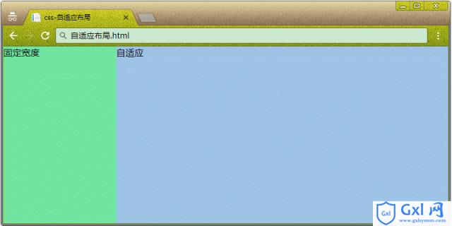
1.1 子元素 float:left
说明:左边的固定列设置为 float:left,右边的自适应列设置为 float:none。
CSS:
* { margin: 0;padding: 0 }
.container {
    position: absolute;
    width: 100%;
    height: 100%;
}
.left {
    float: left;
    width: 200px;
    height: 100%;
    background-color: #72e4a0;
}
.right {
    float: none;
    width: 100%;
    height: 100%;
    background-color: #9dc3e6;
}
1.2 子元素 width:calc()
说明:自适应列的width根据calc()自动计算,如:父容器width - 固定列width。
浏览器支持:IE 9+。
CSS:
* { margin: 0;padding: 0 }
.container {
    position: absolute;
    width: 100%;
    height: 100%;
}
.left {
    float: left;
    width: 200px;
    height: 100%;
    background-color: #72e4a0;
}
.right {
    float: left;
    width: calc(100% - 200px);
    height: 100%;
    background-color: #9dc3e6;
}
1.3 父元素 display: table
说明:父容器采用display: table和table-layout: fixed时,子容器会平分父容器的宽度,这时候固定某列的width,其余的列会继续平分剩下的宽度。
浏览器支持:IE 8+。
CSS:
* { margin: 0;padding: 0 }
.container {
    position: absolute;
    display: table;
    width: 100%;
    height: 100%;
    table-layout: fixed;
}
.left {
    display: table-cell;
    width: 200px;
    height: 100%;
    background-color: #72e4a0;
}
.right {
    display: table-cell;
    width: 100%;
    height: 100%;
    background-color: #9dc3e6;
}
1.4 父元素 display: flex
浏览器支持:IE 10+。
CSS:
* { margin: 0;padding: 0 }
.container {
position: absolute;
display: flex;
width: 100%;
height: 100%;
}
.left {
width: 200px;
height: 100%;
background-color: #72e4a0;
}
.right {
flex: 1;
height: 100%;
background-color: #9dc3e6;
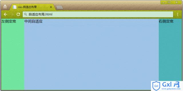
}2. 左右2列固定,中间自适应<p class="container">
<p class="left">左侧定宽</p>
<p class="mid">中间自适应</p>
<p class="right">右侧定宽</p>
</p>
2.1 子元素 width:calc()
说明:自适应列的width根据calc()自动计算,如:父容器width - 固定列width。
浏览器支持:IE 9+。
CSS:
* { margin: 0;padding: 0 }
.container {
    position: absolute;
    width: 100%;
    height: 100%;
}
.left {
    float: left;
    width: 100px;
    height: 100%;
    background-color: #72e4a0;
}
.mid {
    float: left;
    width: calc(100% - 100px - 100px);
    height: 100%;
    background-color: #9dc3e6;
}
.right {
    float: left;
    width: 100px;
    height: 100%;
    background-color: #4eb3b9;
}
2.2 父元素 display: flex
说明:在父元素设置display为flex时,其中一列的flex为1,其余列都设置固定width。
浏览器支持:IE 10+。
CSS:
* { margin: 0;padding: 0 }
.container {
    position: absolute;
    display: flex;
    width: 100%;
    height: 100%;
}
.left {
    float: left;
    width: 100px;
    height: 100%;
    background-color: #72e4a0;
}
.mid {
    float: left;
    height: 100%;
    flex: 1;
    background-color: #9dc3e6;
}
.right {
    float: left;
    width: 100px;
    height: 100%;
    background-color: #4eb3b9;
}
相信看了本文案例你已经掌握了方法,更多精彩请关注Gxl网其它相关文章!
推荐阅读:
在前端中的html基础知识 、
vue插件实现移动端轮播图
Css float的盒子模型position
以上就是CSS自适应布局详解的详细内容,更多请关注Gxl网其它相关文章!
内容总结
以上是互联网集市为您收集整理的CSS自适应布局详解全部内容,希望文章能够帮你解决CSS自适应布局详解所遇到的程序开发问题。 如果觉得互联网集市技术教程内容还不错,欢迎将互联网集市网站推荐给程序员好友。
内容备注
版权声明:本文内容由互联网用户自发贡献,该文观点与技术仅代表作者本人。本站仅提供信息存储空间服务,不拥有所有权,不承担相关法律责任。如发现本站有涉嫌侵权/违法违规的内容, 请发送邮件至 gblab@vip.qq.com 举报,一经查实,本站将立刻删除。
内容手机端
扫描二维码推送至手机访问。