Bootstrap实现渐变顶部固定自适应导航栏
内容导读
互联网集市收集整理的这篇技术教程文章主要介绍了Bootstrap实现渐变顶部固定自适应导航栏,小编现在分享给大家,供广大互联网技能从业者学习和参考。文章包含2816字,纯文字阅读大概需要5分钟。
内容图文

具体代码如下所示:
<!DOCTYPE html>
<html>
<head>
<meta http-equiv="Content-Type" content="text/html; charset=utf-8"/>
 <title></title>
 <meta charset="utf-8" />
 <link href="<%=path%>/css/style.css" rel="stylesheet" type="text/css" />
 <link rel="stylesheet" href="http://cdn.static.runoob.com/libs/bootstrap/3.3.7/css/bootstrap.min.css">
 <script src="http://cdn.static.runoob.com/libs/jquery/2.1.1/jquery.min.js"></script>
 <script src="http://cdn.static.runoob.com/libs/bootstrap/3.3.7/js/bootstrap.min.js"></script>
</head>
<body>
 <nav class="navbar navbar-fixed-top my-navbar" role="navigation">
  <div class="container-fluid">
   <div class="navbar-header">
    <button type="button" class="navbar-toggle" data-toggle="collapse"
      data-target="#example-navbar-collapse">
     <span class="sr-only">切换导航</span>
     <span class="icon-bar"></span>
     <span class="icon-bar"></span>
     <span class="icon-bar"></span>
    </button>
    <a class="navbar-brand" href="#">菜鸟教程</a>
   </div>
   <div class="collapse navbar-collapse" id="example-navbar-collapse">
    <ul class="nav navbar-nav">
     <li class="active"><a href="#">iOS</a></li>
     <li><a href="#">SVN</a></li>
     <li><a href="#">Asp.Net</a></li>
    </ul>
   </div>
  </div>
 </nav>
  <div class="bg"></div>
 <script>
  $(window).scroll(function () {
   if ($(".navbar").offset().top > 50) {$(".navbar-fixed-top").addClass("top-nav");
   }else {$(".navbar-fixed-top").removeClass("top-nav");}
  })</script>
</body></html>
style.css
 html, body {width:100%;height:100%;} /*非常重要的样式让背景图片100%适应整个屏幕*/
  .bg {display: table;width: 100%;height: 100%;padding: 100px 0;text-align: center;color: #fff;background: url(http://www.xiandanke.cn/Image/intro-bg.jpg) no-repeat bottom center;background-color: #000;background-size: cover;}
  .my-navbar {padding:20px 0;transition: background 0.5s ease-in-out, padding 0.5s ease-in-out;}
  .my-navbar a{background:transparent !important;color:#fff !important}
  .my-navbar a:hover {color:#45bcf9 !important;background:transparent;outline:0}
  .my-navbar a {transition: color 0.5s ease-in-out;}/*-webkit-transition ;-moz-transition*/
  .top-nav {padding:0;background:#000;}
  button.navbar-toggle {background-color:#fbfbfb;}/*整个背景都是transparent透明的,会看不到,所以再次覆盖一下*/
  button.navbar-toggle > span.icon-bar {background-color:#dedede}
真的只用了9行代码,原理挺简单的,但是要注意以下几点
1.html,body{width:100%;height:100%} ,必须写这个样式,才能让html中的子元素100%占满整个屏幕,也就是要实现背景图片占满100%的整个屏幕
2.bootstrap中的类 nav-fixed-top的意义在于固定导航栏在顶部
3.添加scroll 事件,在切换class的时候实现动态的效果
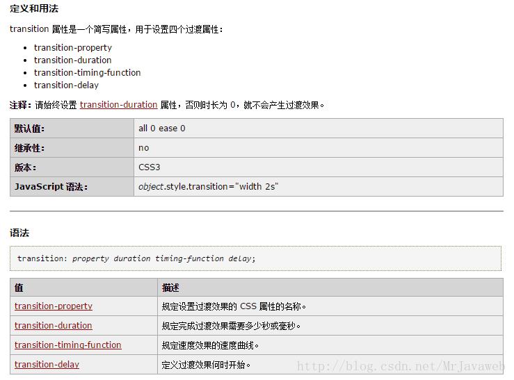
4.整个效果的实现原理是使用了transition 属性,transition属性的使用方法是:
以上所述是小编给大家介绍的Bootstrap实现渐变顶部固定自适应导航栏,希望对大家有所帮助,如果大家有任何疑问请给我留言,小编会及时回复大家的。在此也非常感谢大家对脚本之家网站的支持!
内容总结
以上是互联网集市为您收集整理的Bootstrap实现渐变顶部固定自适应导航栏全部内容,希望文章能够帮你解决Bootstrap实现渐变顶部固定自适应导航栏所遇到的程序开发问题。 如果觉得互联网集市技术教程内容还不错,欢迎将互联网集市网站推荐给程序员好友。
内容备注
版权声明:本文内容由互联网用户自发贡献,该文观点与技术仅代表作者本人。本站仅提供信息存储空间服务,不拥有所有权,不承担相关法律责任。如发现本站有涉嫌侵权/违法违规的内容, 请发送邮件至 gblab@vip.qq.com 举报,一经查实,本站将立刻删除。
内容手机端
扫描二维码推送至手机访问。