sencha touch 模仿tabpanel导航栏TabBar的实例代码
内容导读
互联网集市收集整理的这篇技术教程文章主要介绍了sencha touch 模仿tabpanel导航栏TabBar的实例代码,小编现在分享给大家,供广大互联网技能从业者学习和参考。文章包含2654字,纯文字阅读大概需要4分钟。
内容图文

基于sencha touch 2.2所写
代码:
代码如下:
/*
*模仿tabpanel导航栏
*/
Ext.define('ux.TabBar', {
alternateClassName: 'tabBar',
extend: 'Ext.Toolbar',
xtype: 'tabBar',
config: {
docked: 'bottom',
cls: 'navToolbar',
layout: {
align: 'stretch'
},
defaults: {
flex: 1
},
//被选中的按钮
selectButton: null
},
initialize: function () {
var me = this;
me.callParent();
//监听按钮点击事件
me.on({
delegate: '> button',
scope: me,
tap: 'onButtonTap'
});
},
//更新被选中按钮
updateSelectButton: function (newItem, oldItem) {
console.log(oldItem);
if (oldItem) {
oldItem.removeCls('x-tabBar-pressing');
}
if (newItem) {
newItem.addCls('x-tabBar-pressing');
}
},
//当按钮被点击时
onButtonTap: function (button) {
this.setSelectButton(button);
},
/**
* @private
*执行添加项,调用add方法后自动执行
*/
onItemAdd: function (item, index) {
if (!this.getSelectButton() && item.getInitialConfig('selected')) {
this.setSelectButton(item);
}
this.callParent(arguments);
}
});
需要的css:
代码如下:
.navToolbar {
padding:0;
}
.navToolbar .x-button {
border:0;
margin:0;
border-right:1px solid #585B5B;
border-radius:0;
padding:0;
}
.navToolbar .x-button .x-button-label {
font-weight:normal;
color:White;
font-size:0.6em;
}
.navToolbar .x-tabBar-pressing {
background-image:none;
background-color:#0f517e;
background-image:-webkit-gradient(linear,50% 0%,50% 100%,color-stop(0%,#0a3351),color-stop(10%,#0c4267),color-stop(65%,#0f517e),color-stop(100%,#0f5280));
background-image:-webkit-linear-gradient(top,#0a3351,#0c4267 10%,#0f517e 65%,#0f5280);
background-image:-moz-linear-gradient(top,#0a3351,#0c4267 10%,#0f517e 65%,#0f5280);
background-image:-o-linear-gradient(top,#0a3351,#0c4267 10%,#0f517e 65%,#0f5280);
background-image:linear-gradient(top,#0a3351,#0c4267 10%,#0f517e 65%,#0f5280);
}
使用:
代码如下:
Ext.define('app.view.MyBar', {
alternateClassName: 'myBar',
extend: 'ux.TabBar',
xtype: 'myBar',
config: {
items: [
{
xtype: 'button',
text: '问卷调查',
//只有第一个设置的属性有效
selected: true
},
{
xtype: 'button',
text: '我的积分'
},
{
xtype: 'button',
text: '开奖大厅'
},
{
xtype: 'button',
text: '幸运号码'
},
{
xtype: 'button',
text: '更多'
}]
}
});
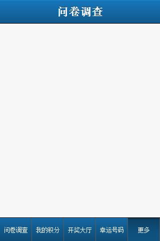
效果图:
内容总结
以上是互联网集市为您收集整理的sencha touch 模仿tabpanel导航栏TabBar的实例代码全部内容,希望文章能够帮你解决sencha touch 模仿tabpanel导航栏TabBar的实例代码所遇到的程序开发问题。 如果觉得互联网集市技术教程内容还不错,欢迎将互联网集市网站推荐给程序员好友。
内容备注
版权声明:本文内容由互联网用户自发贡献,该文观点与技术仅代表作者本人。本站仅提供信息存储空间服务,不拥有所有权,不承担相关法律责任。如发现本站有涉嫌侵权/违法违规的内容, 请发送邮件至 gblab@vip.qq.com 举报,一经查实,本站将立刻删除。
内容手机端
扫描二维码推送至手机访问。