关于CSS3中Animation动画属性的用法解析
内容导读
互联网集市收集整理的这篇技术教程文章主要介绍了关于CSS3中Animation动画属性的用法解析,小编现在分享给大家,供广大互联网技能从业者学习和参考。文章包含3382字,纯文字阅读大概需要5分钟。
内容图文
 这篇文章主要为大家详细介绍了CSS3中Animation动画属性用法,教大家如何使用animation动画,感兴趣的小伙伴们可以参考一下
要使用animation动画,先要熟悉一下keyframes,Keyframes的语法规则:命名是由”@keyframes”开头,后面紧接着是这个“动画的名称”加上一对花括号“{}”,括号中就是一些不同时间段样式规则。不同关键帧是通过from(相当于0%)、to(相当于100%)或百分比来表示(为了得到最佳的浏览器支持,建议使用百分比),如下定义一个简单的动画:
@keyframes myfirst /*定义动画名*/
    {
    0%   {background:red; left:0px; top:0px;} /*定义起始帧样式,0%可以换成from*/
    25%  {background:yellow; left:200px; top:0px;}
    50%  {background:blue; left:200px; top:200px;}
    75%  {background:green; left:0px; top:200px;}
    100% {background:red; left:0px; top:0px;} /*定义结束帧样式,100%可以换成to*/
    }
@keyframes定义好了,要使其能发挥效果,必须通过animation把它绑定到一个选择器,否则动画不会有任何效果。下面列出了animation的属性:
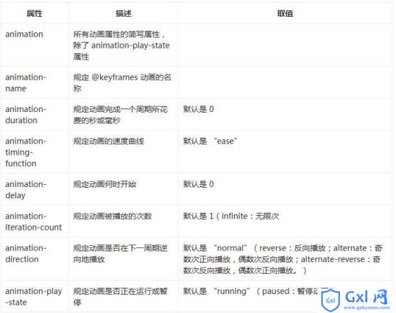
下面设置上述的所有属性
animation-name:myfirst;
animation-duration:5s;
animation-timing-function:linear;
animation-delay:1s;
animation-iteration-count:infinite;
animation-direction:alternate;
animation-play-state:running;
上述所有代码可以如下简写:
animation:myfirst 5s linear 2s infinite alternate;
animation-play-state:running;
浏览器兼容性
Internet Explorer 10、Firefox 以及 Opera 支持 @keyframes 规则和 animation 属性。
Chrome 和 Safari 需要前缀 -webkit-。
注意:Internet Explorer 9,以及更早的版本,不支持 @keyframe 规则或 animation 属性。
下面给出上面介绍的关于keyframes和animation属性的完整代码示例:
<!DOCTYPE html>
<html lang="en">
<head>
    <meta charset="UTF-8">
    <title>animation演示</title>
    <style>
    p
    {
    width:100px;
    height:100px;
    background:red;
    position:relative;
    animation-name:myfirst;
    animation-duration:5s;
    animation-timing-function:linear;
    animation-delay:1s;
    animation-iteration-count:infinite;
    animation-direction:alternate;
    animation-play-state:running;
    /* Safari and Chrome: */
    -webkit-animation-name:myfirst;
    -webkit-animation-duration:5s;
    -webkit-animation-timing-function:linear;
    -webkit-animation-delay:1s;
    -webkit-animation-iteration-count:infinite;
    -webkit-animation-direction:alternate;
    -webkit-animation-play-state:running;
    }
    @keyframes myfirst /*定义动画名*/
    {
    0%   {background:red; left:0px; top:0px;} /*定义起始帧样式,0%相当于from*/
    25%  {background:yellow; left:200px; top:0px;}
    50%  {background:blue; left:200px; top:200px;}
    75%  {background:green; left:0px; top:200px;}
    100% {background:red; left:0px; top:0px;} /*定义结束帧样式,100%相当于to*/
    }
    @-webkit-keyframes myfirst /* Safari and Chrome */
    {
    0%   {background:red; left:0px; top:0px;}
    25%  {background:yellow; left:200px; top:0px;}
    50%  {background:blue; left:200px; top:200px;}
    75%  {background:green; left:0px; top:200px;}
    100% {background:red; left:0px; top:0px;}
    }
    </style>
</head>
<body>
    <p>该实例在 Internet Explorer 9 及更早 IE 版本是无效的。</p>
    <p></p>
</body>
</html>
上面代码演示了一个正方形沿着一个正方形轨迹运动,基数次按正方向运动,偶数次按反方向运动,运动过程中还带有颜色变化。具体效果,读者可以自行运行代码观察。
以上就是本文的全部内容,希望对大家的学习有所帮助,更多相关内容请关注PHP中文网!
相关推荐:
css3的transform中scale缩放的分析
关于CSS中的before和:after伪元素的使用分析
关于CSS文本超出div或者span时用省略号代替的代码
以上就是关于CSS3中Animation动画属性的用法解析的详细内容,更多请关注Gxl网其它相关文章!
内容总结
以上是互联网集市为您收集整理的关于CSS3中Animation动画属性的用法解析全部内容,希望文章能够帮你解决关于CSS3中Animation动画属性的用法解析所遇到的程序开发问题。 如果觉得互联网集市技术教程内容还不错,欢迎将互联网集市网站推荐给程序员好友。
内容备注
版权声明:本文内容由互联网用户自发贡献,该文观点与技术仅代表作者本人。本站仅提供信息存储空间服务,不拥有所有权,不承担相关法律责任。如发现本站有涉嫌侵权/违法违规的内容, 请发送邮件至 gblab@vip.qq.com 举报,一经查实,本站将立刻删除。
内容手机端
扫描二维码推送至手机访问。