首页 / CSS / 纯CSS制作动画效果按钮
纯CSS制作动画效果按钮
内容导读
互联网集市收集整理的这篇技术教程文章主要介绍了纯CSS制作动画效果按钮,小编现在分享给大家,供广大互联网技能从业者学习和参考。文章包含3370字,纯文字阅读大概需要5分钟。
内容图文
 我们知道CSS3是CSS技术的升级版本,CSS3语言开发是朝着模块化发展的。以前的规范作为一个模块实在是太庞大而且比较复杂,所以,把它分解为一些小的模块,更多新的模块也被加入进来。这些模块包括: 盒子模型、列表模块、超链接方式 、语言模块 、背景和边框 、文字特效 、多栏布局等。本篇文章小编和大家分享一款很不错的CSS3按钮动画,这款CSS3按钮一共有5种动画方式,每一种都是鼠标滑过动画形式,虽然这些动画按钮不是十分华丽,但是小编觉得不像其他按钮那样很难扩展,我们可以修改CSS代码随意改变自己喜欢的颜色样式。
HTML代码:
<div class="button01">
      <a href="#">Download</a>
      <p class="top">click to begin</p>
      <p class="bottom">1.2MB .zip</p></div>
CSS代码:
.button01 {
 width: 200px;
 margin: 50px auto 20px auto;}.button01 a {
 display: block;
 height: 50px;
 width: 200px;

 /*TYPE*/
 color: white;
 font: 17px/50px Helvetica, Verdana, sans-serif;
 text-decoration: none;
 text-align: center;
 text-transform: uppercase;

 /*GRADIENT*/
 background: #00b7ea; /* Old browsers */
 background: -moz-linear-gradient(top, #00b7ea 0%, #009ec3 100%); /* FF3.6+ */
 background: -webkit-gradient(linear, left top, left bottom, color-stop(0%,#00b7ea), color-stop(100%,#009ec3)); /* Chrome,Safari4+ */
 background: -webkit-linear-gradient(top, #00b7ea 0%,#009ec3 100%); /* Chrome10+,Safari5.1+ */
 background: -o-linear-gradient(top, #00b7ea 0%,#009ec3 100%); /* Opera 11.10+ */
 background: -ms-linear-gradient(top, #00b7ea 0%,#009ec3 100%); /* IE10+ */
 background: linear-gradient(top, #00b7ea 0%,#009ec3 100%); /* W3C */
 filter: progid:DXImageTransform.Microsoft.gradient( startColorstr='#00b7ea', endColorstr='#009ec3',GradientType=0 ); /* IE6-9 */}.button01 a, p {
   -webkit-border-radius: 10px;
    -moz-border-radius: 10px;
         border-radius: 10px;

 -webkit-box-shadow: 2px 2px 8px rgba(0,0,0,0.2);
    -moz-box-shadow: 2px 2px 8px rgba(0,0,0,0.2);
         box-shadow: 2px 2px 8px rgba(0,0,0,0.2);}p {
 background: #222;
 display: block;
 height: 40px;
 width: 180px;
 margin: -50px 0 0 10px;

 /*TYPE*/
 text-align: center;
 font: 12px/45px Helvetica, Verdana, sans-serif;
 color: #fff;

 /*POSITION*/
 position: absolute;
 z-index: -1;

 /*TRANSITION*/
 -webkit-transition: margin 0.5s ease;
    -moz-transition: margin 0.5s ease;
      -o-transition: margin 0.5s ease;
     -ms-transition: margin 0.5s ease;
         transition: margin 0.5s ease;}/*HOVER*/.button01:hover .bottom {
 margin: -10px 0 0 10px;}.button01:hover .top {
 margin: -80px 0 0 10px;
 line-height: 35px;}/*ACTIVE*/.button01 a:active {
 background: #00b7ea; /* Old browsers */
 background: -moz-linear-gradient(top,  #00b7ea 36%, #009ec3 100%); /* FF3.6+ */
 background: -webkit-gradient(linear, left top, left bottom, color-stop(36%,#00b7ea), color-stop(100%,#009ec3)); /* Chrome,Safari4+ */
 background: -webkit-linear-gradient(top,  #00b7ea 36%,#009ec3 100%); /* Chrome10+,Safari5.1+ */
 background: -o-linear-gradient(top,  #00b7ea 36%,#009ec3 100%); /* Opera 11.10+ */
 background: -ms-linear-gradient(top,  #00b7ea 36%,#009ec3 100%); /* IE10+ */
 background: linear-gradient(top,  #00b7ea 36%,#009ec3 100%); /* W3C */
 filter: progid:DXImageTransform.Microsoft.gradient( startColorstr='#00b7ea', endColorstr='#009ec3',GradientType=0 ); /* IE6-9 */}.button01:active .bottom {
 margin: -20px 0 0 10px;}.button01:active .top {
 margin: -70px 0 0 10px;
样式展示:
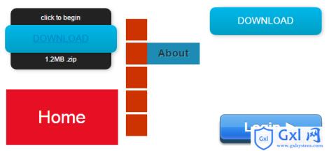
以上只是图片展示,高大上的是点击按钮的效果,大家可以借鉴以上的代码动手试验一下。
相关推荐:
CSS动画技巧与细节
关于CSS动画属性的详解
CSS制作立体导航栏的实现方法介绍
以上就是纯CSS制作动画效果按钮的详细内容,更多请关注Gxl网其它相关文章!
内容总结
以上是互联网集市为您收集整理的纯CSS制作动画效果按钮全部内容,希望文章能够帮你解决纯CSS制作动画效果按钮所遇到的程序开发问题。 如果觉得互联网集市技术教程内容还不错,欢迎将互联网集市网站推荐给程序员好友。
内容备注
版权声明:本文内容由互联网用户自发贡献,该文观点与技术仅代表作者本人。本站仅提供信息存储空间服务,不拥有所有权,不承担相关法律责任。如发现本站有涉嫌侵权/违法违规的内容, 请发送邮件至 gblab@vip.qq.com 举报,一经查实,本站将立刻删除。
内容手机端
扫描二维码推送至手机访问。
来源:【匿名】