使用css给未知宽高的元素添加背景图片方法
内容导读
互联网集市收集整理的这篇技术教程文章主要介绍了使用css给未知宽高的元素添加背景图片方法,小编现在分享给大家,供广大互联网技能从业者学习和参考。文章包含2812字,纯文字阅读大概需要5分钟。
内容图文
 给页面的某一元素添加背景图片,当没有指定具体的宽高时,是无法显示效果的
1、添加背景图
HTML代码:
<!DOCTYPE html>
<html>
<head lang="en">
    <meta charset="UTF-8">
    <meta name="viewport" content="width=device-width,initial-scale=1.0,minimum-scale=1.0,maximum-scale=1.0,user-scalable=no"/>
    <meta name="format-detection" content="telephone=no"/>
    <meta name="format-detection" content="email=no"/>
    <title></title>
    <style>
        *{margin:0; padding:0;}
        #wrap{
            width:100%;
            height:auto;
            background:url('images/page.jpg') no-repeat center center;
            background-size:cover;
        }
    </style>
</head>
<body>
    <div id="wrap">
    </div>
</body>
</html>
我们可以看看页面效果截图:

为了达到适应不同终端的屏幕大小,我们又不能把宽高写死,那怎么办呢?可以采取以下方法:
HTML代码:
<!DOCTYPE html>
<html>
<head lang="en">
    <meta charset="UTF-8">
    <meta name="viewport" content="width=device-width,initial-scale=1.0,minimum-scale=1.0,maximum-scale=1.0,user-scalable=no"/>
    <meta name="format-detection" content="telephone=no"/>
    <meta name="format-detection" content="email=no"/>
    <title></title>
    <style>
        *{margin:0; padding:0;}
        #wrap{
            width:100%;
            height:100%;
            background:url('images/page-small.jpg') no-repeat;
            background-size:cover;
            position:fixed;
            z-index:-10;
            background-position:0 0;
        }
    </style>
</head>
<body>
    <div id="wrap">
    </div>
</body>
</html>
再来看看页面效果:

手机页面效果

注意:如果去掉div,直接把样式加在body上面的话,在PC端浏览器可以显示,安卓手机里面也可以显示,但是在苹果手机里面就无法显示。多次反复测试,均重现此bug(如有朋友遇到此类问题的正解,欢迎指教!)
(上图为苹果机型下的截图)
2、通过img标签添加背景图
HTML代码:
<!DOCTYPE html>
<html>
<head lang="en">
    <meta charset="UTF-8">
    <meta name="viewport" content="width=device-width,initial-scale=1.0,minimum-scale=1.0,maximum-scale=1.0,user-scalable=no"/>
    <meta name="format-detection" content="telephone=no"/>
    <meta name="format-detection" content="email=no"/>
    <title></title>
    <style>
        *{margin:0; padding:0;}
    </style>
</head>
<body>
    <div id="wrap">
        <img class="imgBcground" src="images/page-small.jpg" alt="">
    </div>
</body>
</html>
查看页面效果时发现,图片是以百分百实际大小呈现,显然不是我们想要的效果

跟上面的例子很相像,我们只需要稍加修改就好
HTML代码:
<!DOCTYPE html>
<html>
<head lang="en">
    <meta charset="UTF-8">
    <meta name="viewport" content="width=device-width,initial-scale=1.0,minimum-scale=1.0,maximum-scale=1.0,user-scalable=no"/>
    <meta name="format-detection" content="telephone=no"/>
    <meta name="format-detection" content="email=no"/>
    <title></title>
    <style>
        *{margin:0; padding:0;}
        .imgBcground{
            display:block;
            width:100%;
            height:100%;
            position:fixed;
            z-index:-10;
        }
    </style>
</head>
<body>
    <div id="wrap">
        <img class="imgBcground" src="images/page-small.jpg" alt="">
    </div>
</body>
</html>
在不同模拟机型下查看页面效果均可以实现:

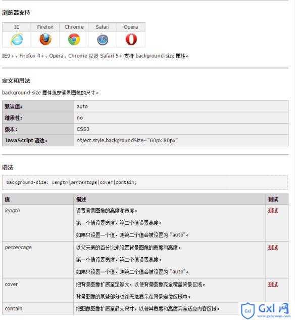
关于background-size属性,W3C是这么定义的
以上就是使用css给未知宽高的元素添加背景图片方法的详细内容,更多请关注Gxl网其它相关文章!
内容总结
以上是互联网集市为您收集整理的使用css给未知宽高的元素添加背景图片方法全部内容,希望文章能够帮你解决使用css给未知宽高的元素添加背景图片方法所遇到的程序开发问题。 如果觉得互联网集市技术教程内容还不错,欢迎将互联网集市网站推荐给程序员好友。
内容备注
版权声明:本文内容由互联网用户自发贡献,该文观点与技术仅代表作者本人。本站仅提供信息存储空间服务,不拥有所有权,不承担相关法律责任。如发现本站有涉嫌侵权/违法违规的内容, 请发送邮件至 gblab@vip.qq.com 举报,一经查实,本站将立刻删除。
内容手机端
扫描二维码推送至手机访问。