CSS3实现10种Loading效果方法
内容导读
互联网集市收集整理的这篇技术教程文章主要介绍了CSS3实现10种Loading效果方法,小编现在分享给大家,供广大互联网技能从业者学习和参考。文章包含5184字,纯文字阅读大概需要8分钟。
内容图文
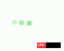
 用CSS3实现了几种常见的Loading效果,虽然很简单,但还是分享一下,顺便也当是做做笔记……
第1种效果:

代码如下:
<p class="loading">
        <span></span>
        <span></span>
        <span></span>
        <span></span>
        <span></span>
</p>
.loading{
width: 80px;
height: 40px;
margin: 0 auto;
margin-top:100px;
}
.loading span{
display: inline-block;
width: 8px;
height: 100%;
border-radius: 4px;
background: lightgreen;
-webkit-animation: load 1s ease infinite;
}
@-webkit-keyframes load{
0%,100%{
height: 40px;
background: lightgreen;
}
50%{
height: 70px;
margin: -15px 0;
background: lightblue;
}
}
.loading span:nth-child(2){
-webkit-animation-delay:0.2s;
}
.loading span:nth-child(3){
-webkit-animation-delay:0.4s;
}
.loading span:nth-child(4){
-webkit-animation-delay:0.6s;
}
.loading span:nth-child(5){
-webkit-animation-delay:0.8s;
}第2种效果:
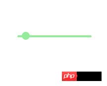
代码如下:
<p class="loading">
        <span></span>
</p>
.loading{
width: 150px;
height: 4px;
border-radius: 2px;
margin: 0 auto;
margin-top:100px;
position: relative;
background: lightgreen;
-webkit-animation: changeBgColor 1.04s ease-in infinite alternate;
}
.loading span{
display: inline-block;
width: 16px;
height: 16px;
border-radius: 50%;
background: lightgreen;
position: absolute;
margin-top: -7px;
margin-left:-8px;
-webkit-animation: changePosition 1.04s ease-in infinite alternate;
}
@-webkit-keyframes changeBgColor{
0%{
background: lightgreen;
}
100%{
background: lightblue;
}
}
@-webkit-keyframes changePosition{
0%{
background: lightgreen;
}
100%{
margin-left: 142px;
background: lightblue;
}
}第3-5种效果:
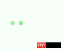

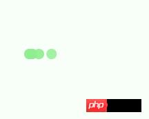
代码如下:
<p class="loading">
        <span></span>
        <span></span>
        <span></span>
        <span></span>
        <span></span>
</p>
第3-5种效果的css样式分别为:
.loading{
            width: 150px;
            height: 15px;
            margin: 0 auto;
            position: relative;
            margin-top:100px;
        }
        .loading span{
            position: absolute;
            width: 15px;
            height: 100%;
            border-radius: 50%;
            background: lightgreen;
            -webkit-animation: load 1.04s ease-in infinite alternate;
        }
        @-webkit-keyframes load{
            0%{
                opacity: 1;
                -webkit-transform: translate(0px);
            }
            100%{
                opacity: 0.2;
                -webkit-transform: translate(150px);
            }
        }
        .loading span:nth-child(1){
            -webkit-animation-delay:0.13s;
        }
        .loading span:nth-child(2){
            -webkit-animation-delay:0.26s;
        }
        .loading span:nth-child(3){
            -webkit-animation-delay:0.39s;
        }
        .loading span:nth-child(4){
            -webkit-animation-delay:0.52s;
        }
        .loading span:nth-child(5){
            -webkit-animation-delay:0.65s;
        }
第6-8种效果:
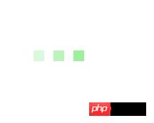

代码如下:
<p class="loading">
        <span></span>
        <span></span>
        <span></span>
        <span></span>
        <span></span>
</p>
第6-8种效果的css样式分别为:
.loading{
            width: 150px;
            height: 15px;
            margin: 0 auto;
            margin-top:100px;
            text-align: center;
        }
        .loading span{
            display: inline-block;
            width: 15px;
            height: 100%;
            margin-right: 5px;
            background: lightgreen;
            -webkit-animation: load 1.04s ease infinite;
        }
        .loading span:last-child{
            margin-right: 0px;
        }
        @-webkit-keyframes load{
            0%{
                opacity: 1;
            }
            100%{
                opacity: 0;
            }
        }
        .loading span:nth-child(1){
            -webkit-animation-delay:0.13s;
        }
        .loading span:nth-child(2){
            -webkit-animation-delay:0.26s;
        }
        .loading span:nth-child(3){
            -webkit-animation-delay:0.39s;
        }
        .loading span:nth-child(4){
            -webkit-animation-delay:0.52s;
        }
        .loading span:nth-child(5){
            -webkit-animation-delay:0.65s;
        }
第9-10种效果:


代码如下:
<p class="loadEffect">
        <span></span>
        <span></span>
        <span></span>
        <span></span>
        <span></span>
        <span></span>
        <span></span>
        <span></span>
</p>
CSS样式分别为:
.loadEffect{
            width: 100px;
            height: 100px;
            position: relative;
            margin: 0 auto;
            margin-top:100px;
        }
        .loadEffect span{
            display: inline-block;
            width: 16px;
            height: 16px;
            border-radius: 50%;
            background: lightgreen;
            position: absolute;
            -webkit-animation: load 1.04s ease infinite;
        }
        @-webkit-keyframes load{
            0%{
                opacity: 1;
            }
            100%{
                opacity: 0.2;
            }
        }
        .loadEffect span:nth-child(1){
            left: 0;
            top: 50%;
            margin-top:-8px;
            -webkit-animation-delay:0.13s;
        }
        .loadEffect span:nth-child(2){
            left: 14px;
            top: 14px;
            -webkit-animation-delay:0.26s;
        }
        .loadEffect span:nth-child(3){
            left: 50%;
            top: 0;
            margin-left: -8px;
            -webkit-animation-delay:0.39s;
        }
        .loadEffect span:nth-child(4){
            top: 14px;
            rightright:14px;
            -webkit-animation-delay:0.52s;
        }
        .loadEffect span:nth-child(5){
            rightright: 0;
            top: 50%;
            margin-top:-8px;
            -webkit-animation-delay:0.65s;
        }
        .loadEffect span:nth-child(6){
            rightright: 14px;
            bottombottom:14px;
            -webkit-animation-delay:0.78s;
        }
        .loadEffect span:nth-child(7){
            bottombottom: 0;
            left: 50%;
            margin-left: -8px;
            -webkit-animation-delay:0.91s;
        }
        .loadEffect span:nth-child(8){
            bottombottom: 14px;
            left: 14px;
            -webkit-animation-delay:1.04s;
        }
PS:CSS样式代码其实很多重复,主要就是动画不一样,但为了方便以后直接拿来用,就先不整理了。
以上就是本文的全部内容,希望对大家的学习有所帮助,也希望大家多多支持PHP中文网。
更多CSS3实现10种Loading效果方法相关文章请关注PHP中文网!
内容总结
以上是互联网集市为您收集整理的CSS3实现10种Loading效果方法全部内容,希望文章能够帮你解决CSS3实现10种Loading效果方法所遇到的程序开发问题。 如果觉得互联网集市技术教程内容还不错,欢迎将互联网集市网站推荐给程序员好友。
内容备注
版权声明:本文内容由互联网用户自发贡献,该文观点与技术仅代表作者本人。本站仅提供信息存储空间服务,不拥有所有权,不承担相关法律责任。如发现本站有涉嫌侵权/违法违规的内容, 请发送邮件至 gblab@vip.qq.com 举报,一经查实,本站将立刻删除。
内容手机端
扫描二维码推送至手机访问。