CSS3教程-动画
内容导读
互联网集市收集整理的这篇技术教程文章主要介绍了CSS3教程-动画,小编现在分享给大家,供广大互联网技能从业者学习和参考。文章包含4990字,纯文字阅读大概需要8分钟。
内容图文
 或许你已经看过很多关于CSS3动画的技术,包括前端开发之前发表的一些,那么现在就请看一看CSS3教程-动画的基础知识吧。
CSS3 动画:
通过 CSS3,我们能够创建动画,这可以在许多网页中取代动画图片、Flash 动画以及 JavaScript。

CSS3 @keyframes 规则:
如需在 CSS3 中创建动画,您需要学习 @keyframes 规则。
@keyframes 规则用于创建动画。在 @keyframes 中规定某项 CSS 样式,就能创建由当前样式逐渐改为新样式的动画效果。
浏览器支持:
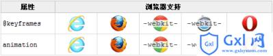
Internet Explorer 10、Firefox 以及 Opera 支持 @keyframes 规则和 animation 属性。
Chrome 和 Safari 需要前缀 -webkit-。
注释:Internet Explorer 9,以及更早的版本,不支持 @keyframe 规则或 animation 属性。
实例:
@keyframes myfirst
{
from {background: red;}
to {background: yellow;}
}
@-moz-keyframes myfirst /* Firefox */
{
from {background: red;}
to {background: yellow;}
}
@-webkit-keyframes myfirst /* Safari 和 Chrome */
{
from {background: red;}
to {background: yellow;}
}
@-o-keyframes myfirst /* Opera */
{
from {background: red;}
to {background: yellow;}
}
CSS3 动画:
当您在 @keyframes 中创建动画时,请把它捆绑到某个选择器,否则不会产生动画效果。
通过规定至少以下两项 CSS3 动画属性,即可将动画绑定到选择器:
1、规定动画的名称;
2、规定动画的时长。
实例:
把 “myfirst” 动画捆绑到 div 元素,时长:5 秒:
div
{
animation: myfirst 5s;
-moz-animation: myfirst 5s; /* Firefox */
-webkit-animation: myfirst 5s; /* Safari 和 Chrome */
-o-animation: myfirst 5s; /* Opera */
}
注释:您必须定义动画的名称和时长。如果忽略时长,则动画不会允许,因为默认值是 0。
什么是 CSS3 中的动画?
动画是使元素从一种样式逐渐变化为另一种样式的效果。
您可以改变任意多的样式任意多的次数。
请用百分比来规定变化发生的时间,或用关键词 “from” 和 “to”,等同于 0% 和 100%。
0% 是动画的开始,100% 是动画的完成。
为了得到最佳的浏览器支持,您应该始终定义 0% 和 100% 选择器。
实例:
当动画为 25% 及 50% 时改变背景色,然后当动画 100% 完成时再次改变:
@keyframes myfirst
{
0% {background: red;}
25% {background: yellow;}
50% {background: blue;}
100% {background: green;}
}
@-moz-keyframes myfirst /* Firefox */
{
0% {background: red;}
25% {background: yellow;}
50% {background: blue;}
100% {background: green;}
}
@-webkit-keyframes myfirst /* Safari 和 Chrome */
{
0% {background: red;}
25% {background: yellow;}
50% {background: blue;}
100% {background: green;}
}
@-o-keyframes myfirst /* Opera */
{
0% {background: red;}
25% {background: yellow;}
50% {background: blue;}
100% {background: green;}
实例:
改变背景色和位置:
@keyframes myfirst
{
0% {background: red; left:0px; top:0px;}
25% {background: yellow; left:200px; top:0px;}
50% {background: blue; left:200px; top:200px;}
75% {background: green; left:0px; top:200px;}
100% {background: red; left:0px; top:0px;}
}
@-moz-keyframes myfirst /* Firefox */
{
0% {background: red; left:0px; top:0px;}
25% {background: yellow; left:200px; top:0px;}
50% {background: blue; left:200px; top:200px;}
75% {background: green; left:0px; top:200px;}
100% {background: red; left:0px; top:0px;}
}
@-webkit-keyframes myfirst /* Safari 和 Chrome */
{
0% {background: red; left:0px; top:0px;}
25% {background: yellow; left:200px; top:0px;}
50% {background: blue; left:200px; top:200px;}
75% {background: green; left:0px; top:200px;}
100% {background: red; left:0px; top:0px;}
}
@-o-keyframes myfirst /* Opera */
{
0% {background: red; left:0px; top:0px;}
25% {background: yellow; left:200px; top:0px;}
50% {background: blue; left:200px; top:200px;}
75% {background: green; left:0px; top:200px;}
100% {background: red; left:0px; top:0px;}
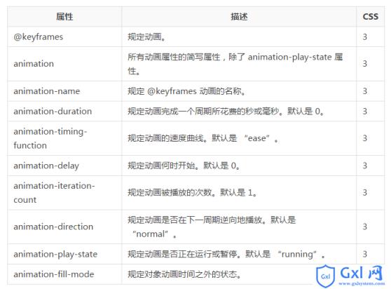
}CSS3 动画属性:
下面的表格列出了 @keyframes 规则和所有动画属性:
下面的两个例子设置了所有动画属性:
实例:
运行名为 myfirst 的动画,其中设置了所有动画属性:
div
{
animation-name: myfirst;
animation-duration: 5s;
animation-timing-function: linear;
animation-delay: 2s;
animation-iteration-count: infinite;
animation-direction: alternate;
animation-play-state: running;
/* Firefox: */
-moz-animation-name: myfirst;
-moz-animation-duration: 5s;
-moz-animation-timing-function: linear;
-moz-animation-delay: 2s;
-moz-animation-iteration-count: infinite;
-moz-animation-direction: alternate;
-moz-animation-play-state: running;
/* Safari 和 Chrome: */
-webkit-animation-name: myfirst;
-webkit-animation-duration: 5s;
-webkit-animation-timing-function: linear;
-webkit-animation-delay: 2s;
-webkit-animation-iteration-count: infinite;
-webkit-animation-direction: alternate;
-webkit-animation-play-state: running;
/* Opera: */
-o-animation-name: myfirst;
-o-animation-duration: 5s;
-o-animation-timing-function: linear;
-o-animation-delay: 2s;
-o-animation-iteration-count: infinite;
-o-animation-direction: alternate;
-o-animation-play-state: running;
}
实例:
与上面的动画相同,但是使用了简写的动画 animation 属性:
div
{
animation: myfirst 5s linear 2s infinite alternate;
/* Firefox: */
-moz-animation: myfirst 5s linear 2s infinite alternate;
/* Safari 和 Chrome: */
-webkit-animation: myfirst 5s linear 2s infinite alternate;
/* Opera: */
-o-animation: myfirst 5s linear 2s infinite alternate;
}
以上就是CSS3教程-动画的内容,更多相关内容请关注PHP中文网(www.gxlcms.com)!
内容总结
以上是互联网集市为您收集整理的CSS3教程-动画全部内容,希望文章能够帮你解决CSS3教程-动画所遇到的程序开发问题。 如果觉得互联网集市技术教程内容还不错,欢迎将互联网集市网站推荐给程序员好友。
内容备注
版权声明:本文内容由互联网用户自发贡献,该文观点与技术仅代表作者本人。本站仅提供信息存储空间服务,不拥有所有权,不承担相关法律责任。如发现本站有涉嫌侵权/违法违规的内容, 请发送邮件至 gblab@vip.qq.com 举报,一经查实,本站将立刻删除。
内容手机端
扫描二维码推送至手机访问。