首页 / CSS / 如何使用纯CSS实现一个沙漏的动画效果
如何使用纯CSS实现一个沙漏的动画效果
内容导读
互联网集市收集整理的这篇技术教程文章主要介绍了如何使用纯CSS实现一个沙漏的动画效果,小编现在分享给大家,供广大互联网技能从业者学习和参考。文章包含2536字,纯文字阅读大概需要4分钟。
内容图文
 本篇文章给大家带来的内容是关于如何使用css实现监控网络连接状态的页面 ,有一定的参考价值,有需要的朋友可以参考一下,希望对你有所帮助。
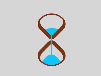
效果预览
源代码下载
https://github.com/comehope/front-end-daily-challenges
代码解读
定义 dom,容器中包含 2 个元素,分别代表沙漏的上半部和下半部:
<div class="loader">
    <span class="top"></span>
    <span class="bottom"></span>
</div>
居中显示:
body {
    margin: 0;
    height: 100vh;
    display: flex;
    align-items: center;
    justify-content: center;
    background-color: gainsboro;
}
定义容器尺寸,并设置子元素整体布局:
.loader {
    width: 4.3em;
    height: 9.8em;
    font-size: 10px;
    position: relative;
    display: flex;
    flex-direction: column;
    align-items: center;
    justify-content: space-between;
}
画出 2 个正方形:
.top,
.bottom {
    width: 3.5em;
    height: 3.5em;
    border-style: solid;
    border-color: saddlebrown;
}
通过边框、圆角和旋转,把 2 个正方形变成沙漏形状:
.top,
.bottom {
    border-width: 0.2em 0.2em 0.6em 0.6em;
    border-radius: 50% 100% 50% 30%;
}

.top {
    transform: rotate(-45deg);
}

.bottom {
    transform: rotate(135deg);
}
用伪元素画出沙子,上部的沙子的顶部是大圆弧,下部的沙子的顶部是小圆弧:
.top::before,
.bottom::before {
    content: '';
    position: absolute;
    width: inherit;
    height: inherit;
    background-color: deepskyblue;
}

.top::before {
    border-radius: 0 100% 0 0;
}

.bottom::before {
    border-radius: 0 0 0 35%;
}
定义沙子的动画属性:
.top::before,
.bottom::before {
    animation: 2s linear infinite;
}
增加沙子从沙漏的上半部落下的动画效果:
.top::before {
    animation-name: drop-sand;
}

@keyframes drop-sand {
    to {
        transform: translate(-2.5em, 2.5em);
    }
}
增加沙子的沙漏在下半部堆积的动画效果:
.bottom::before {
    transform: translate(2.5em, -2.5em);
    animation-name: fill-sand;
}

@keyframes fill-sand {
    to {
        transform: translate(0, 0);
    }
}
隐藏沙漏上半部和下半部容器外的部分,此时上面 2 个动画的叠加效果是沙子从上半部漏下,慢慢在下半部堆积:
.top,
.bottom {
    overflow: hidden;
}
用外层容器的伪元素制作一个窄长条,模拟流动的沙子:
.loader::after {
    content: '';
    position: absolute;
    width: 0.2em;
    height: 4.8em;
    background-color: deepskyblue;
    top: 1em;
}
增加沙子流动的动画效果:
.loader::after {
    animation: flow 2s linear infinite;
}

@keyframes flow {
    10%, 100% {
        transform: translateY(3.2em);
    }
}
最后,增加沙漏的翻转动画:
.loader {
    animation: rotating 2s linear infinite;
}

@keyframes rotating {
    0%, 90% {
        transform: rotate(0);
    }

    100% {
        transform: rotate(0.5turn);
    }
}
大功告成!
相关推荐:
如何使用CSS和D3实现一组彩灯(附代码)
如何使用纯CSS实现一只红色的愤怒小鸟(附代码)以上就是如何使用纯CSS实现一个沙漏的动画效果的详细内容。
内容总结
以上是互联网集市为您收集整理的如何使用纯CSS实现一个沙漏的动画效果全部内容,希望文章能够帮你解决如何使用纯CSS实现一个沙漏的动画效果所遇到的程序开发问题。 如果觉得互联网集市技术教程内容还不错,欢迎将互联网集市网站推荐给程序员好友。
内容备注
版权声明:本文内容由互联网用户自发贡献,该文观点与技术仅代表作者本人。本站仅提供信息存储空间服务,不拥有所有权,不承担相关法律责任。如发现本站有涉嫌侵权/违法违规的内容, 请发送邮件至 gblab@vip.qq.com 举报,一经查实,本站将立刻删除。
内容手机端
扫描二维码推送至手机访问。