如何使用纯CSS实现抽象的水波荡漾的动画(附源码)
内容导读
互联网集市收集整理的这篇技术教程文章主要介绍了如何使用纯CSS实现抽象的水波荡漾的动画(附源码),小编现在分享给大家,供广大互联网技能从业者学习和参考。文章包含2139字,纯文字阅读大概需要4分钟。
内容图文
") 本篇文章给大家带来的内容是关于如何使用纯CSS实现抽象的水波荡漾的动画(附源码),有一定的参考价值,有需要的朋友可以参考一下,希望对你有所帮助。
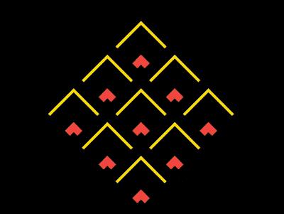
本篇文章给大家带来的内容是关于如何使用纯CSS实现抽象的水波荡漾的动画(附源码),有一定的参考价值,有需要的朋友可以参考一下,希望对你有所帮助。效果预览
源代码下载
https://github.com/comehope/front-end-daily-challenges
代码解读
定义 dom,容器中包含 9 个元素:
<div class="container">
    <span></span>
    <span></span>
    <span></span>
    <span></span>
    <span></span>
    <span></span>
    <span></span>
    <span></span>
    <span></span>
</div>
居中显示:
body {
    margin: 0;
    height: 100vh;
    display: flex;
    align-items: center;
    justify-content: center;
    background-color: black;
}
定义容器尺寸:
.container {
    width: 30em;
    height: 30em;
    font-size: 10px;
}
用 grid 布局把 9 个子元素排列成 3 * 3 的网格状:
.container {
    display: grid;
    grid-template-columns: repeat(3, 1fr);
}
设置容器内子元素的样式,是通过伪元素来设置的:
.container span {
    position: relative;
}

.container span::before,
.container span::after
{
    content: '';
    position: absolute;
    box-sizing: border-box;
    border-style: none solid solid none;
    border-width: 1em;
    border-color: gold;
    width: 100%;
    height: 100%;
}
旋转容器,让它的尖端朝上:
.container {
    transform: rotate(-135deg);
}
增加子元素尺寸由小到大变化的动画:
.container span::before,
.container span::after
{
    animation:
        animate-scale 1.6s linear infinite;
}

@keyframes animate-scale {
    from {
        width: 1%;
        height: 1%;
    }

    to {
        width: 100%;
        height: 100%;
    }
}
增加子元素边框色变化的动画:
.container span::before,
.container span::after
{
    animation:
        animate-border-color 1.6s linear infinite,
        animate-scale 1.6s linear infinite;
}

@keyframes animate-border-color {
    0%, 25% {
        border-color: tomato;
    }

    50%, 75% {
        border-color: gold;
    }

    100% {
        border-color: black;
    }
}
增加子元素边框宽度变化的动画:
.container span::before,
.container span::after
{
    animation:
        animate-border-width 1.6s linear infinite,
        animate-border-color 1.6s linear infinite,
        animate-scale 1.6s linear infinite;
}
最后,让 ::after 伪元素的动画时间慢半拍:
.container span::after {
    animation-delay: -0.8s;
}

@keyframes animate-border-width {
    0%, 100%{
        border-width: 0.1em;
    }

    25% {
        border-width: 1.5em;
    }
}
大功告成!
以上就是如何使用纯CSS实现抽象的水波荡漾的动画(附源码)的详细内容。
内容总结
以上是互联网集市为您收集整理的如何使用纯CSS实现抽象的水波荡漾的动画(附源码)全部内容,希望文章能够帮你解决如何使用纯CSS实现抽象的水波荡漾的动画(附源码)所遇到的程序开发问题。 如果觉得互联网集市技术教程内容还不错,欢迎将互联网集市网站推荐给程序员好友。
内容备注
版权声明:本文内容由互联网用户自发贡献,该文观点与技术仅代表作者本人。本站仅提供信息存储空间服务,不拥有所有权,不承担相关法律责任。如发现本站有涉嫌侵权/违法违规的内容, 请发送邮件至 gblab@vip.qq.com 举报,一经查实,本站将立刻删除。
内容手机端
扫描二维码推送至手机访问。