首页 / PYTHON / 【Python教程】绘制仪表盘图
【Python教程】绘制仪表盘图
内容导读
互联网集市收集整理的这篇技术教程文章主要介绍了【Python教程】绘制仪表盘图,小编现在分享给大家,供广大互联网技能从业者学习和参考。文章包含3543字,纯文字阅读大概需要6分钟。
内容图文
 Bokeh(Bokeh.js)是一个可在Python中提供交互式的可视化库,其支持Web浏览器,并提供类似于D3.js软件一样的完美展示功能。本文简单介绍如何使用该程序库绘制仪表盘图,具体操作如下:
导入命令
1)设置工作环境
%cd "F:\\Dropbox\\python"
2)导入程序包
import matplotlib.pyplot as plt
import numpy as np
from matplotlib.image import BboxImage
from matplotlib._png import read_png
import matplotlib.colors
from matplotlib.cbook import get_sample_data
from collections import OrderedDict
from math import log, sqrt
import numpy as np
import pandas as pd
from bokeh.plotting import figure, show, output_file
3)读取数据
df =pd.read_csv("stata_auto.csv" )4)定义参数并绘制图像
drug_color = OrderedDict([
("price", "#0d3362"),
("weight", "#c64737"),
("rep78", "black" ),
])
gram_color = {
"Domestic" : "#aeaeb8",
"Foreign" : "#e69584",
}
width = 800
height = 800
inner_radius = 90
outer_radius = 300 - 10
minr = sqrt(log(.001 * 1E4))
maxr = sqrt(log(1000 * 1E4))
a = (outer_radius - inner_radius) / (minr - maxr)
b = inner_radius - a * maxr
def rad(mic):
return a * np.sqrt(np.log(mic * 1E4)) + b
big_angle = 2.0 * np.pi / (len(df) + 1)
small_angle = big_angle / 7
x = np.zeros(len(df))
y = np.zeros(len(df))
output_file("burtin.html", title="burtin.py example")
p = figure(plot_width=width, plot_height=height, title="",
x_axis_type=None, y_axis_type=None,
x_range=[-420, 420], y_range=[-420, 420],
min_border=0, outline_line_color="black",
background_fill="#f0e1d2", border_fill="#f0e1d2")
p.line(x+1, y+1, alpha=0)
angles = np.pi/2 - big_angle/2 - df.index.to_series()*big_angle
colors = [gram_color[gram] for gram in df.foreign]
p.annular_wedge(
x, y, inner_radius, outer_radius, -big_angle+angles, angles, color=colors,
)
p.annular_wedge(x, y, inner_radius, rad(df.price),
-big_angle+angles+5*small_angle, -big_angle+angles+6*small_angle,
color=drug_color['price'])
p.annular_wedge(x, y, inner_radius, rad(df.mpg),
-big_angle+angles+3*small_angle, -big_angle+angles+4*small_angle,
color=drug_color['weight'])
p.annular_wedge(x, y, inner_radius, rad(df.gear_ratio),
-big_angle+angles+1*small_angle, -big_angle+angles+2*small_angle,
color=drug_color['rep78'])
labels = np.power(10.0, np.arange(-3, 4))
radii = a * np.sqrt(np.log(labels * 1E4)) + b
p.circle(x, y, radius=radii, fill_color=None, line_color="white")
p.text(x[:-1], radii[:-1], [str(r) for r in labels[:-1]],
text_font_size="8pt", text_align="center", text_baseline="middle")
p.annular_wedge(x, y, inner_radius-10, outer_radius+10,
-big_angle+angles, -big_angle+angles, color="black")
xr = radii[0]*np.cos(np.array(-big_angle/2 + angles))
yr = radii[0]*np.sin(np.array(-big_angle/2 + angles))
label_angle=np.array(-big_angle/2+angles)
label_angle[label_angle < -np.pi/2] += np.pi # easier to read labels on the left side
p.text(xr, yr, df.make, angle=label_angle,
text_font_size="9pt", text_align="center", text_baseline="middle")
p.circle([-40, -40], [-370, -390], color=list(gram_color.values()), radius=5)
p.text([-30, -30], [-370, -390], text=["Gram-" + gr for gr in gram_color.keys()],
text_font_size="7pt", text_align="left", text_baseline="middle")
p.rect([-40, -40, -40], [18, 0, -18], width=30, height=13,
color=list(drug_color.values()))
p.text([-15, -15, -15], [18, 0, -18], text=list(drug_color.keys()),
text_font_size="9pt", text_align="left", text_baseline="middle")
p.xgrid.grid_line_color = None
p.ygrid.grid_line_color = None
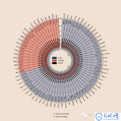
show(p)输出图像如下
以上就是【Python教程】绘制仪表盘图的内容,更多相关内容请关注PHP中文网(www.gxlcms.com)!
内容总结
以上是互联网集市为您收集整理的【Python教程】绘制仪表盘图全部内容,希望文章能够帮你解决【Python教程】绘制仪表盘图所遇到的程序开发问题。 如果觉得互联网集市技术教程内容还不错,欢迎将互联网集市网站推荐给程序员好友。
内容备注
版权声明:本文内容由互联网用户自发贡献,该文观点与技术仅代表作者本人。本站仅提供信息存储空间服务,不拥有所有权,不承担相关法律责任。如发现本站有涉嫌侵权/违法违规的内容, 请发送邮件至 gblab@vip.qq.com 举报,一经查实,本站将立刻删除。
内容手机端
扫描二维码推送至手机访问。
来源:【匿名】