python的matplotlib的热门可视化动图
内容导读
互联网集市收集整理的这篇技术教程文章主要介绍了python的matplotlib的热门可视化动图,小编现在分享给大家,供广大互联网技能从业者学习和参考。文章包含2400字,纯文字阅读大概需要4分钟。
内容图文

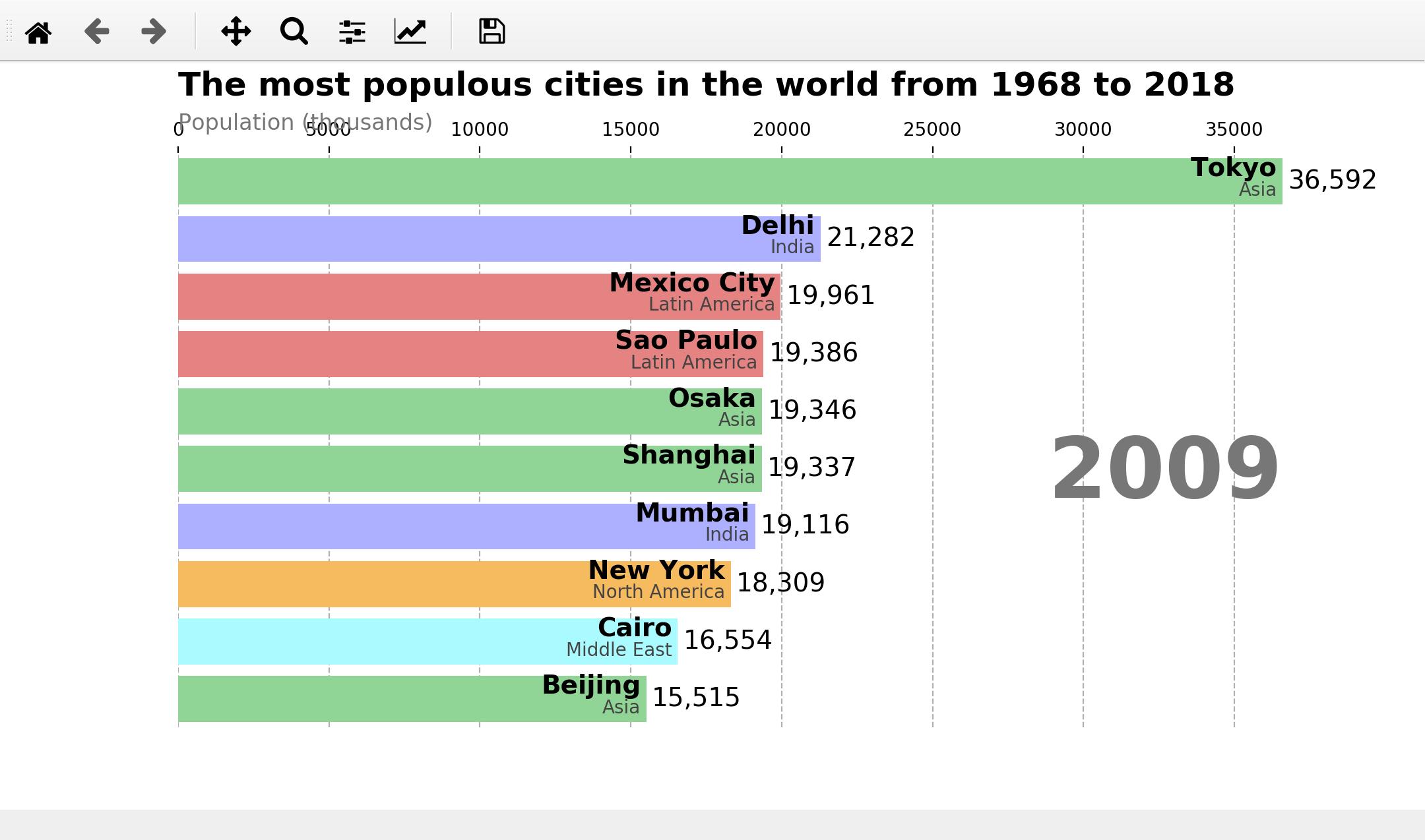
1.图
2.代码
import pandas as pd
import matplotlib as mpl
import matplotlib.pyplot as plt
import matplotlib.ticker as ticker
import matplotlib.animation as animation
#导出数据,当然这个数据也可以是直接在网上下载,是的有点慢
#网址:https://gist.githubusercontent.com/johnburnmurdoch/4199dbe55095c3e13de8d5b2e5e5307a/raw/fa018b25c24b7b5f47fd0568937ff6c04e384786/city_populations
df = pd.read_csv('city_populations.csv',
                 usecols=['name', 'group', 'year', 'value']) #将数据下载下来放在指定默认的目录和文件夹下,city_populations.csv
#定义
current_year = 2018
dff=()

fig, ax = plt.subplots(figsize=(15, 8))

colors = dict(zip(
    ['India', 'Europe', 'Asia', 'Latin America',
     'Middle East', 'North America', 'Africa'],
    ['#adb0ff', '#ffb3ff', '#90d595', '#e48381',
     '#aafbff', '#f7bb5f', '#eafb50']
))

group_lk = df.set_index('name')['group'].to_dict()

def draw_barchart(year):
    dff = df[df['year'].eq(year)].sort_values(by='value', ascending=True).tail(10)
    ax.clear() #每次清空、刷新
    ax.barh(dff['name'], dff['value'], color=[colors[group_lk[x]] for x in dff['name']])
    dx = dff['value'].max() / 200
    for i, (value, name) in enumerate(zip(dff['value'], dff['name'])):
        ax.text(value-dx, i,     name,           size=14, weight=600, ha='right', va='bottom')
        ax.text(value-dx, i-.25, group_lk[name], size=10, color='#444444', ha='right', va='baseline')
        ax.text(value+dx, i,     f'{value:,.0f}',  size=14, ha='left',  va='center')
    #显示文字,x=0,y=1.10,坐标,ha=水平对准=水平线平放
    #ax.text()格式=(x,y,string,fontsize=15,verticalalignment="top",horizontalalignment="right")
    #string=字符串='文字内容'
    ax.text(0, 1.10, 'The most populous cities in the world from 1968 to 2018',
            transform=ax.transAxes, size=18, weight=600, ha='left') #文字标题,第1层
    ax.text(0, 1.04, 'Population (thousands)', transform=ax.transAxes, size=12, color='#777777') #显示文字,第2层
    ax.text(1, 0.4, year, transform=ax.transAxes, color='#777777', size=46, ha='right', weight=800) #右边固定显示动图年份
    #va=verticalalignment="top",垂直对准
    #ha=horizontalalignment="right",alignment=对准,水平对准
    ax.xaxis.set_ticks_position('top')  #x轴在上面

    ax.set_yticks([]) #默认是显示y轴的名称,左边垂直的城市名字,设为[]就是不显示
    ax.margins(0, 0.01) #不设置就是默认值,缩放比例(0,0.05)
    ax.grid(which='major', axis='x', linestyle='--') #垂直线,布局和格式
    ax.set_axisbelow(True)  #默认是true的

    plt.box(False) #默认是True,False之后不显示黑色线框

animator = animation.FuncAnimation(fig, draw_barchart, frames=range(1968, 2019)) #以animator形式展现动画
plt.show() #以plt的形式展现图片
内容总结
以上是互联网集市为您收集整理的python的matplotlib的热门可视化动图全部内容,希望文章能够帮你解决python的matplotlib的热门可视化动图所遇到的程序开发问题。 如果觉得互联网集市技术教程内容还不错,欢迎将互联网集市网站推荐给程序员好友。
内容备注
版权声明:本文内容由互联网用户自发贡献,该文观点与技术仅代表作者本人。本站仅提供信息存储空间服务,不拥有所有权,不承担相关法律责任。如发现本站有涉嫌侵权/违法违规的内容, 请发送邮件至 gblab@vip.qq.com 举报,一经查实,本站将立刻删除。
内容手机端
扫描二维码推送至手机访问。
来源:【匿名】