Python基础-matplotlib-03-各种绘图实例
内容导读
互联网集市收集整理的这篇技术教程文章主要介绍了Python基础-matplotlib-03-各种绘图实例,小编现在分享给大家,供广大互联网技能从业者学习和参考。文章包含24408字,纯文字阅读大概需要35分钟。
内容图文

matplotlib各种绘图实例
李金的中文Python笔记[https://github.com/lijin-thu/notes-python]的学习笔记及摘要。
简单绘图
plot 函数:
%matplotlib inline

import numpy as np
import matplotlib.pyplot as plt

t = np.arange(0.0, 2.0, 0.01)
s = np.sin(2*np.pi*t)
plt.plot(t, s)

plt.xlabel('time (s)')
plt.ylabel('voltage (mV)')
plt.title('About as simple as it gets, folks')
plt.grid(True)
plt.show()
子图
subplot 函数:
import numpy as np
import matplotlib.mlab as mlab

x1 = np.linspace(0.0, 5.0)
x2 = np.linspace(0.0, 2.0)

y1 = np.cos(2 * np.pi * x1) * np.exp(-x1)
y2 = np.cos(2 * np.pi * x2)

plt.subplot(2, 1, 1)
plt.plot(x1, y1, 'yo-')
plt.title('A tale of 2 subplots')
plt.ylabel('Damped oscillation')

plt.subplot(2, 1, 2)
plt.plot(x2, y2, 'r.-')
plt.xlabel('time (s)')
plt.ylabel('Undamped')

plt.show()

直方图
hist 函数:
import numpy as np
import matplotlib.mlab as mlab
import matplotlib.pyplot as plt

# example data
mu = 100 # mean of distribution
sigma = 15 # standard deviation of distribution
x = mu + sigma * np.random.randn(10000)

num_bins = 50
# the histogram of the data
n, bins, patches = plt.hist(x, num_bins, normed=1, facecolor='green', alpha=0.5)
# add a 'best fit' line
y = mlab.normpdf(bins, mu, sigma)
plt.plot(bins, y, 'r--')
plt.xlabel('Smarts')
plt.ylabel('Probability')
plt.title(r'Histogram of IQ: $\mu=100$, $\sigma=15$')

# Tweak spacing to prevent clipping of ylabel
plt.subplots_adjust(left=0.15)
plt.show()

路径图
matplotlib.path 包:
import matplotlib.path as mpath
import matplotlib.patches as mpatches
import matplotlib.pyplot as plt

fig, ax = plt.subplots()

Path = mpath.Path
path_data = [
    (Path.MOVETO, (1.58, -2.57)),
    (Path.CURVE4, (0.35, -1.1)),
    (Path.CURVE4, (-1.75, 2.0)),
    (Path.CURVE4, (0.375, 2.0)),
    (Path.LINETO, (0.85, 1.15)),
    (Path.CURVE4, (2.2, 3.2)),
    (Path.CURVE4, (3, 0.05)),
    (Path.CURVE4, (2.0, -0.5)),
    (Path.CLOSEPOLY, (1.58, -2.57)),
    ]
codes, verts = zip(*path_data)
path = mpath.Path(verts, codes)
patch = mpatches.PathPatch(path, facecolor='r', alpha=0.5)
ax.add_patch(patch)

# plot control points and connecting lines
x, y = zip(*path.vertices)
line, = ax.plot(x, y, 'go-')

ax.grid()
ax.axis('equal')
plt.show()

三维绘图
导入 Axex3D:
from mpl_toolkits.mplot3d import Axes3D
from matplotlib import cm
from matplotlib.ticker import LinearLocator, FormatStrFormatter
import matplotlib.pyplot as plt
import numpy as np

fig = plt.figure()
ax = fig.gca(projection='3d')
X = np.arange(-5, 5, 0.25)
Y = np.arange(-5, 5, 0.25)
X, Y = np.meshgrid(X, Y)
R = np.sqrt(X**2 + Y**2)
Z = np.sin(R)
surf = ax.plot_surface(X, Y, Z, rstride=1, cstride=1, cmap=cm.coolwarm,
        linewidth=0, antialiased=False)
ax.set_zlim(-1.01, 1.01)

ax.zaxis.set_major_locator(LinearLocator(10))
ax.zaxis.set_major_formatter(FormatStrFormatter('%.02f'))

fig.colorbar(surf, shrink=0.5, aspect=5)

plt.show()

流向图
主要函数:plt.streamplot
import numpy as np
import matplotlib.pyplot as plt

Y, X = np.mgrid[-3:3:100j, -3:3:100j]
U = -1 - X**2 + Y
V = 1 + X - Y**2
speed = np.sqrt(U*U + V*V)

plt.streamplot(X, Y, U, V, color=U, linewidth=2, cmap=plt.cm.autumn)
plt.colorbar()

f, (ax1, ax2) = plt.subplots(ncols=2)
ax1.streamplot(X, Y, U, V, density=[0.5, 1])

lw = 5*speed/speed.max()
ax2.streamplot(X, Y, U, V, density=0.6, color='k', linewidth=lw)

plt.show()


椭圆
Ellipse 对象:
from pylab import figure, show, rand
from matplotlib.patches import Ellipse

NUM = 250

ells = [Ellipse(xy=rand(2)*10, width=rand(), height=rand(), angle=rand()*360)
        for i in range(NUM)]

fig = figure()
ax = fig.add_subplot(111, aspect='equal')
for e in ells:
    ax.add_artist(e)
    e.set_clip_box(ax.bbox)
    e.set_alpha(rand())
    e.set_facecolor(rand(3))

ax.set_xlim(0, 10)
ax.set_ylim(0, 10)

show()

条状图
bar 函数:
import numpy as np
import matplotlib.pyplot as plt


n_groups = 5

means_men = (20, 35, 30, 35, 27)
std_men = (2, 3, 4, 1, 2)

means_women = (25, 32, 34, 20, 25)
std_women = (3, 5, 2, 3, 3)

fig, ax = plt.subplots()

index = np.arange(n_groups)
bar_width = 0.35

opacity = 0.4
error_config = {'ecolor': '0.3'}

rects1 = plt.bar(index, means_men, bar_width,
                 alpha=opacity,
                 color='b',
                 yerr=std_men,
                 error_kw=error_config,
                 label='Men')

rects2 = plt.bar(index + bar_width, means_women, bar_width,
                 alpha=opacity,
                 color='r',
                 yerr=std_women,
                 error_kw=error_config,
                 label='Women')

plt.xlabel('Group')
plt.ylabel('Scores')
plt.title('Scores by group and gender')
plt.xticks(index + bar_width, ('A', 'B', 'C', 'D', 'E'))
plt.legend()

plt.tight_layout()
plt.show()

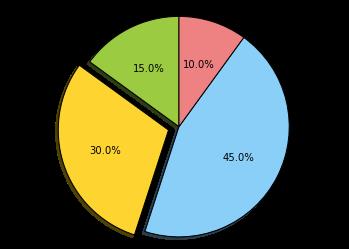
饼状图
pie 函数:
import matplotlib.pyplot as plt


# The slices will be ordered and plotted counter-clockwise.
labels = 'Frogs', 'Hogs', 'Dogs', 'Logs'
sizes = [15, 30, 45, 10]
colors = ['yellowgreen', 'gold', 'lightskyblue', 'lightcoral']
explode = (0, 0.1, 0, 0) # only "explode" the 2nd slice (i.e. 'Hogs')

plt.pie(sizes, explode=explode, labels=labels, colors=colors,
        autopct='%1.1f%%', shadow=True, startangle=90)
# Set aspect ratio to be equal so that pie is drawn as a circle.
plt.axis('equal')

plt.show()
图像中的表格
table 函数:
import numpy as np
import matplotlib.pyplot as plt


data = [[  66386,  174296,   75131,  577908,   32015],
        [  58230,  381139,   78045,   99308,  160454],
        [  89135,   80552,  152558,  497981,  603535],
        [  78415,   81858,  150656,  193263,   69638],
        [ 139361,  331509,  343164,  781380,   52269]]

columns = ('Freeze', 'Wind', 'Flood', 'Quake', 'Hail')
rows = ['%d year' % x for x in (100, 50, 20, 10, 5)]

values = np.arange(0, 2500, 500)
value_increment = 1000

# Get some pastel shades for the colors
colors = plt.cm.BuPu(np.linspace(0, 0.5, len(columns)))
n_rows = len(data)

index = np.arange(len(columns)) + 0.3
bar_width = 0.4

# Initialize the vertical-offset for the stacked bar chart.
y_offset = np.array([0.0] * len(columns))

# Plot bars and create text labels for the table
cell_text = []
for row in range(n_rows):
    plt.bar(index, data[row], bar_width, bottom=y_offset, color=colors[row])
    y_offset = y_offset + data[row]
    cell_text.append(['%1.1f' % (x/1000.0) for x in y_offset])
# Reverse colors and text labels to display the last value at the top.
colors = colors[::-1]
cell_text.reverse()

# Add a table at the bottom of the axes
the_table = plt.table(cellText=cell_text,
                      rowLabels=rows,
                      rowColours=colors,
                      colLabels=columns,
                      loc='bottom')

# Adjust layout to make room for the table:
plt.subplots_adjust(left=0.2, bottom=0.2)

plt.ylabel("Loss in ${0}'s".format(value_increment))
plt.yticks(values * value_increment, ['%d' % val for val in values])
plt.xticks([])
plt.title('Loss by Disaster')

plt.show()

散点图
scatter 函数:
import numpy as np
import matplotlib.pyplot as plt
import matplotlib.cbook as cbook

# Load a numpy record array from yahoo csv data with fields date,
# open, close, volume, adj_close from the mpl-data/example directory.
# The record array stores python datetime.date as an object array in
# the date column
datafile = cbook.get_sample_data('goog.npy')
price_data = np.load(datafile).view(np.recarray)
price_data = price_data[-250:] # get the most recent 250 trading days

delta1 = np.diff(price_data.adj_close)/price_data.adj_close[:-1]

# Marker size in units of points^2
volume = (15 * price_data.volume[:-2] / price_data.volume[0])**2
close = 0.003 * price_data.close[:-2] / 0.003 * price_data.open[:-2]

fig, ax = plt.subplots()
ax.scatter(delta1[:-1], delta1[1:], c=close, s=volume, alpha=0.5)

ax.set_xlabel(r'$\Delta_i$', fontsize=20)
ax.set_ylabel(r'$\Delta_{i+1}$', fontsize=20)
ax.set_title('Volume and percent change')

ax.grid(True)
fig.tight_layout()

plt.show()

设置按钮
matplotlib.widgets 模块:
import numpy as np
import matplotlib.pyplot as plt
from matplotlib.widgets import Slider, Button, RadioButtons

fig, ax = plt.subplots()
plt.subplots_adjust(left=0.25, bottom=0.25)
t = np.arange(0.0, 1.0, 0.001)
a0 = 5
f0 = 3
s = a0*np.sin(2*np.pi*f0*t)
l, = plt.plot(t,s, lw=2, color='red')
plt.axis([0, 1, -10, 10])

axcolor = 'lightgoldenrodyellow'
axfreq = plt.axes([0.25, 0.1, 0.65, 0.03], axisbg=axcolor)
axamp  = plt.axes([0.25, 0.15, 0.65, 0.03], axisbg=axcolor)

sfreq = Slider(axfreq, 'Freq', 0.1, 30.0, valinit=f0)
samp = Slider(axamp, 'Amp', 0.1, 10.0, valinit=a0)

def update(val):
    amp = samp.val
    freq = sfreq.val
    l.set_ydata(amp*np.sin(2*np.pi*freq*t))
    fig.canvas.draw_idle()
sfreq.on_changed(update)
samp.on_changed(update)

resetax = plt.axes([0.8, 0.025, 0.1, 0.04])
button = Button(resetax, 'Reset', color=axcolor, hovercolor='0.975')
def reset(event):
    sfreq.reset()
    samp.reset()
button.on_clicked(reset)

rax = plt.axes([0.025, 0.5, 0.15, 0.15], axisbg=axcolor)
radio = RadioButtons(rax, ('red', 'blue', 'green'), active=0)
def colorfunc(label):
    l.set_color(label)
    fig.canvas.draw_idle()
radio.on_clicked(colorfunc)

plt.show()

填充曲线
fill 函数:
import numpy as np
import matplotlib.pyplot as plt


x = np.linspace(0, 1)
y = np.sin(4 * np.pi * x) * np.exp(-5 * x)

plt.fill(x, y, 'r')
plt.grid(True)
plt.show()

时间刻度
"""
Show how to make date plots in matplotlib using date tick locators and
formatters.  See major_minor_demo1.py for more information on
controlling major and minor ticks

All matplotlib date plotting is done by converting date instances into
days since the 0001-01-01 UTC.  The conversion, tick locating and
formatting is done behind the scenes so this is most transparent to
you.  The dates module provides several converter functions date2num
and num2date

"""
import datetime
import numpy as np
import matplotlib.pyplot as plt
import matplotlib.dates as mdates
import matplotlib.cbook as cbook

years    = mdates.YearLocator()   # every year
months   = mdates.MonthLocator()  # every month
yearsFmt = mdates.DateFormatter('%Y')

# load a numpy record array from yahoo csv data with fields date,
# open, close, volume, adj_close from the mpl-data/example directory.
# The record array stores python datetime.date as an object array in
# the date column
datafile = cbook.get_sample_data('goog.npy')
r = np.load(datafile).view(np.recarray)

fig, ax = plt.subplots()
ax.plot(r.date, r.adj_close)


# format the ticks
ax.xaxis.set_major_locator(years)
ax.xaxis.set_major_formatter(yearsFmt)
ax.xaxis.set_minor_locator(months)

datemin = datetime.date(r.date.min().year, 1, 1)
datemax = datetime.date(r.date.max().year+1, 1, 1)
ax.set_xlim(datemin, datemax)

# format the coords message box
def price(x): return '$%1.2f'%x
ax.format_xdata = mdates.DateFormatter('%Y-%m-%d')
ax.format_ydata = price
ax.grid(True)

# rotates and right aligns the x labels, and moves the bottom of the
# axes up to make room for them
fig.autofmt_xdate()

plt.show()

金融数据
import datetime
import numpy as np
import matplotlib.colors as colors
import matplotlib.finance as finance
import matplotlib.dates as mdates
import matplotlib.ticker as mticker
import matplotlib.mlab as mlab
import matplotlib.pyplot as plt
import matplotlib.font_manager as font_manager


startdate = datetime.date(2006,1,1)
today = enddate = datetime.date.today()
ticker = 'SPY'


fh = finance.fetch_historical_yahoo(ticker, startdate, enddate)
# a numpy record array with fields: date, open, high, low, close, volume, adj_close)

r = mlab.csv2rec(fh); fh.close()
r.sort()


def moving_average(x, n, type='simple'):
    """
    compute an n period moving average.

    type is 'simple' | 'exponential'

    """
    x = np.asarray(x)
    if type=='simple':
        weights = np.ones(n)
    else:
        weights = np.exp(np.linspace(-1., 0., n))

    weights /= weights.sum()


    a =  np.convolve(x, weights, mode='full')[:len(x)]
    a[:n] = a[n]
    return a

def relative_strength(prices, n=14):
    """
    compute the n period relative strength indicator
    http://stockcharts.com/school/doku.php?id=chart_school:glossary_r#relativestrengthindex
    http://www.investopedia.com/terms/r/rsi.asp
    """

    deltas = np.diff(prices)
    seed = deltas[:n+1]
    up = seed[seed>=0].sum()/n
    down = -seed[seed<0].sum()/n
    rs = up/down
    rsi = np.zeros_like(prices)
    rsi[:n] = 100. - 100./(1.+rs)

    for i in range(n, len(prices)):
        delta = deltas[i-1] # cause the diff is 1 shorter

        if delta>0:
            upval = delta
            downval = 0.
        else:
            upval = 0.
            downval = -delta

        up = (up*(n-1) + upval)/n
        down = (down*(n-1) + downval)/n

        rs = up/down
        rsi[i] = 100. - 100./(1.+rs)

    return rsi

def moving_average_convergence(x, nslow=26, nfast=12):
    """
    compute the MACD (Moving Average Convergence/Divergence) using a fast and slow exponential moving avg'
    return value is emaslow, emafast, macd which are len(x) arrays
    """
    emaslow = moving_average(x, nslow, type='exponential')
    emafast = moving_average(x, nfast, type='exponential')
    return emaslow, emafast, emafast - emaslow


plt.rc('axes', grid=True)
plt.rc('grid', color='0.75', linestyle='-', linewidth=0.5)

textsize = 9
left, width = 0.1, 0.8
rect1 = [left, 0.7, width, 0.2]
rect2 = [left, 0.3, width, 0.4]
rect3 = [left, 0.1, width, 0.2]


fig = plt.figure(facecolor='white')
axescolor  = '#f6f6f6'  # the axes background color

ax1 = fig.add_axes(rect1, axisbg=axescolor)  #left, bottom, width, height
ax2 = fig.add_axes(rect2, axisbg=axescolor, sharex=ax1)
ax2t = ax2.twinx()
ax3  = fig.add_axes(rect3, axisbg=axescolor, sharex=ax1)


### plot the relative strength indicator
prices = r.adj_close
rsi = relative_strength(prices)
fillcolor = 'darkgoldenrod'

ax1.plot(r.date, rsi, color=fillcolor)
ax1.axhline(70, color=fillcolor)
ax1.axhline(30, color=fillcolor)
ax1.fill_between(r.date, rsi, 70, where=(rsi>=70), facecolor=fillcolor, edgecolor=fillcolor)
ax1.fill_between(r.date, rsi, 30, where=(rsi<=30), facecolor=fillcolor, edgecolor=fillcolor)
ax1.text(0.6, 0.9, '>70 = overbought', va='top', transform=ax1.transAxes, fontsize=textsize)
ax1.text(0.6, 0.1, '<30 = oversold', transform=ax1.transAxes, fontsize=textsize)
ax1.set_ylim(0, 100)
ax1.set_yticks([30,70])
ax1.text(0.025, 0.95, 'RSI (14)', va='top', transform=ax1.transAxes, fontsize=textsize)
ax1.set_title('%s daily'%ticker)

### plot the price and volume data
dx = r.adj_close - r.close
low = r.low + dx
high = r.high + dx

deltas = np.zeros_like(prices)
deltas[1:] = np.diff(prices)
up = deltas>0
ax2.vlines(r.date[up], low[up], high[up], color='black', label='_nolegend_')
ax2.vlines(r.date[~up], low[~up], high[~up], color='black', label='_nolegend_')
ma20 = moving_average(prices, 20, type='simple')
ma200 = moving_average(prices, 200, type='simple')

linema20, = ax2.plot(r.date, ma20, color='blue', lw=2, label='MA (20)')
linema200, = ax2.plot(r.date, ma200, color='red', lw=2, label='MA (200)')


last = r[-1]
s = '%s O:%1.2f H:%1.2f L:%1.2f C:%1.2f, V:%1.1fM Chg:%+1.2f' % (
    today.strftime('%d-%b-%Y'),
    last.open, last.high,
    last.low, last.close,
    last.volume*1e-6,
    last.close-last.open )
t4 = ax2.text(0.3, 0.9, s, transform=ax2.transAxes, fontsize=textsize)

props = font_manager.FontProperties(size=10)
leg = ax2.legend(loc='center left', shadow=True, fancybox=True, prop=props)
leg.get_frame().set_alpha(0.5)


volume = (r.close*r.volume)/1e6  # dollar volume in millions
vmax = volume.max()
poly = ax2t.fill_between(r.date, volume, 0, label='Volume', facecolor=fillcolor, edgecolor=fillcolor)
ax2t.set_ylim(0, 5*vmax)
ax2t.set_yticks([])


### compute the MACD indicator
fillcolor = 'darkslategrey'
nslow = 26
nfast = 12
nema = 9
emaslow, emafast, macd = moving_average_convergence(prices, nslow=nslow, nfast=nfast)
ema9 = moving_average(macd, nema, type='exponential')
ax3.plot(r.date, macd, color='black', lw=2)
ax3.plot(r.date, ema9, color='blue', lw=1)
ax3.fill_between(r.date, macd-ema9, 0, alpha=0.5, facecolor=fillcolor, edgecolor=fillcolor)


ax3.text(0.025, 0.95, 'MACD (%d, %d, %d)'%(nfast, nslow, nema), va='top',
         transform=ax3.transAxes, fontsize=textsize)

#ax3.set_yticks([])
# turn off upper axis tick labels, rotate the lower ones, etc
for ax in ax1, ax2, ax2t, ax3:
    if ax!=ax3:
        for label in ax.get_xticklabels():
            label.set_visible(False)
    else:
        for label in ax.get_xticklabels():
            label.set_rotation(30)
            label.set_horizontalalignment('right')

    ax.fmt_xdata = mdates.DateFormatter('%Y-%m-%d')


class MyLocator(mticker.MaxNLocator):
    def __init__(self, *args, **kwargs):
        mticker.MaxNLocator.__init__(self, *args, **kwargs)

    def __call__(self, *args, **kwargs):
        return mticker.MaxNLocator.__call__(self, *args, **kwargs)

# at most 5 ticks, pruning the upper and lower so they don't overlap
# with other ticks
#ax2.yaxis.set_major_locator(mticker.MaxNLocator(5, prune='both'))
#ax3.yaxis.set_major_locator(mticker.MaxNLocator(5, prune='both'))

ax2.yaxis.set_major_locator(MyLocator(5, prune='both'))
ax3.yaxis.set_major_locator(MyLocator(5, prune='both'))

plt.show()

basemap 画地图
需要安装 basemap 包:
import matplotlib.pyplot as plt
import numpy as np

try:
    from mpl_toolkits.basemap import Basemap
    have_basemap = True
except ImportError:
    have_basemap = False


def plotmap():
    # create figure
    fig = plt.figure(figsize=(8,8))
    # set up orthographic map projection with
    # perspective of satellite looking down at 50N, 100W.
    # use low resolution coastlines.
    map = Basemap(projection='ortho',lat_0=50,lon_0=-100,resolution='l')
    # lat/lon coordinates of five cities.
    lats=[40.02,32.73,38.55,48.25,17.29]
    lons=[-105.16,-117.16,-77.00,-114.21,-88.10]
    cities=['Boulder, CO','San Diego, CA',
            'Washington, DC','Whitefish, MT','Belize City, Belize']
    # compute the native map projection coordinates for cities.
    xc,yc = map(lons,lats)
    # make up some data on a regular lat/lon grid.
    nlats = 73; nlons = 145; delta = 2.*np.pi/(nlons-1)
    lats = (0.5*np.pi-delta*np.indices((nlats,nlons))[0,:,:])
    lons = (delta*np.indices((nlats,nlons))[1,:,:])
    wave = 0.75*(np.sin(2.*lats)**8*np.cos(4.*lons))
    mean = 0.5*np.cos(2.*lats)*((np.sin(2.*lats))**2 + 2.)
    # compute native map projection coordinates of lat/lon grid.
    # (convert lons and lats to degrees first)
    x, y = map(lons*180./np.pi, lats*180./np.pi)
    # draw map boundary
    map.drawmapboundary(color="0.9")
    # draw graticule (latitude and longitude grid lines)
    map.drawmeridians(np.arange(0,360,30),color="0.9")
    map.drawparallels(np.arange(-90,90,30),color="0.9")
    # plot filled circles at the locations of the cities.
    map.plot(xc,yc,'wo')
    # plot the names of five cities.
    for name,xpt,ypt in zip(cities,xc,yc):
        plt.text(xpt+100000,ypt+100000,name,fontsize=9,color='w')
    # contour data over the map.
    cs = map.contour(x,y,wave+mean,15,linewidths=1.5)
    # draw blue marble image in background.
    # (downsample the image by 50% for speed)
    map.bluemarble(scale=0.5)

def plotempty():
    # create figure
    fig = plt.figure(figsize=(8,8))
    fig.text(0.5, 0.5, "Sorry, could not import Basemap",
                                horizontalalignment='center')

if have_basemap:
    plotmap()
else:
    plotempty()
plt.show()

对数图
loglog, semilogx, semilogy, errorbar 函数:
import numpy as np
import matplotlib.pyplot as plt

plt.subplots_adjust(hspace=0.4)
t = np.arange(0.01, 20.0, 0.01)

# log y axis
plt.subplot(221)
plt.semilogy(t, np.exp(-t/5.0))
plt.title('semilogy')
plt.grid(True)

# log x axis
plt.subplot(222)
plt.semilogx(t, np.sin(2*np.pi*t))
plt.title('semilogx')
plt.grid(True)

# log x and y axis
plt.subplot(223)
plt.loglog(t, 20*np.exp(-t/10.0), basex=2)
plt.grid(True)
plt.title('loglog base 4 on x')

# with errorbars: clip non-positive values
ax = plt.subplot(224)
ax.set_xscale("log", nonposx='clip')
ax.set_yscale("log", nonposy='clip')

x = 10.0**np.linspace(0.0, 2.0, 20)
y = x**2.0
plt.errorbar(x, y, xerr=0.1*x, yerr=5.0+0.75*y)
ax.set_ylim(ymin=0.1)
ax.set_title('Errorbars go negative')


plt.show()

极坐标
设置 polar=True:
import numpy as np
import matplotlib.pyplot as plt


r = np.arange(0, 3.0, 0.01)
theta = 2 * np.pi * r

ax = plt.subplot(111, polar=True)
ax.plot(theta, r, color='r', linewidth=3)
ax.set_rmax(2.0)
ax.grid(True)

ax.set_title("A line plot on a polar axis", va='bottom')
plt.show()

标注
legend 函数:
import numpy as np
import matplotlib.pyplot as plt

# Make some fake data.
a = b = np.arange(0,3, .02)
c = np.exp(a)
d = c[::-1]

# Create plots with pre-defined labels.
plt.plot(a, c, 'k--', label='Model length')
plt.plot(a, d, 'k:', label='Data length')
plt.plot(a, c+d, 'k', label='Total message length')

legend = plt.legend(loc='upper center', shadow=True, fontsize='x-large')

# Put a nicer background color on the legend.
legend.get_frame().set_facecolor('#00FFCC')

plt.show()

数学公式
from __future__ import print_function
import matplotlib.pyplot as plt
import os
import sys
import re
import gc

# Selection of features following "Writing mathematical expressions" tutorial
mathtext_titles = {
    0: "Header demo",
    1: "Subscripts and superscripts",
    2: "Fractions, binomials and stacked numbers",
    3: "Radicals",
    4: "Fonts",
    5: "Accents",
    6: "Greek, Hebrew",
    7: "Delimiters, functions and Symbols"}
n_lines = len(mathtext_titles)

# Randomly picked examples
mathext_demos = {
    0: r"$W^{3\beta}_{\delta_1 \rho_1 \sigma_2} = "
    r"U^{3\beta}_{\delta_1 \rho_1} + \frac{1}{8 \pi 2} "
    r"\int^{\alpha_2}_{\alpha_2} d \alpha^\prime_2 \left[\frac{ "
    r"U^{2\beta}_{\delta_1 \rho_1} - \alpha^\prime_2U^{1\beta}_"
    r"{\rho_1 \sigma_2} }{U^{0\beta}_{\rho_1 \sigma_2}}\right]$",

    1: r"$\alpha_i > \beta_i,\ "
    r"\alpha_{i+1}^j = {\rm sin}(2\pi f_j t_i) e^{-5 t_i/\tau},\ "
    r"\ldots$",

    2: r"$\frac{3}{4},\ \binom{3}{4},\ \stackrel{3}{4},\ "
    r"\left(\frac{5 - \frac{1}{x}}{4}\right),\ \ldots$",

    3: r"$\sqrt{2},\ \sqrt[3]{x},\ \ldots$",

    4: r"$\mathrm{Roman}\ , \ \mathit{Italic}\ , \ \mathtt{Typewriter} \ "
    r"\mathrm{or}\ \mathcal{CALLIGRAPHY}$",

    5: r"$\acute a,\ \bar a,\ \breve a,\ \dot a,\ \ddot a, \ \grave a, \ "
    r"\hat a,\ \tilde a,\ \vec a,\ \widehat{xyz},\ \widetilde{xyz},\ "
    r"\ldots$",

    6: r"$\alpha,\ \beta,\ \chi,\ \delta,\ \lambda,\ \mu,\ "
    r"\Delta,\ \Gamma,\ \Omega,\ \Phi,\ \Pi,\ \Upsilon,\ \nabla,\ "
    r"\aleph,\ \beth,\ \daleth,\ \gimel,\ \ldots$",

    7: r"$\coprod,\ \int,\ \oint,\ \prod,\ \sum,\ "
    r"\log,\ \sin,\ \approx,\ \oplus,\ \star,\ \varpropto,\ "
    r"\infty,\ \partial,\ \Re,\ \leftrightsquigarrow, \ \ldots$"}


def doall():
    # Colors used in mpl online documentation.
    mpl_blue_rvb = (191./255., 209./256., 212./255.)
    mpl_orange_rvb = (202/255., 121/256., 0./255.)
    mpl_grey_rvb = (51./255., 51./255., 51./255.)

    # Creating figure and axis.
    plt.figure(figsize=(6, 7))
    plt.axes([0.01, 0.01, 0.98, 0.90], axisbg="white", frameon=True)
    plt.gca().set_xlim(0., 1.)
    plt.gca().set_ylim(0., 1.)
    plt.gca().set_title("Matplotlib's math rendering engine",
                        color=mpl_grey_rvb, fontsize=14, weight='bold')
    plt.gca().set_xticklabels("", visible=False)
    plt.gca().set_yticklabels("", visible=False)

    # Gap between lines in axes coords
    line_axesfrac = (1. / (n_lines))

    # Plotting header demonstration formula
    full_demo = mathext_demos[0]
    plt.annotate(full_demo,
                 xy=(0.5, 1. - 0.59*line_axesfrac),
                 xycoords='data', color=mpl_orange_rvb, ha='center',
                 fontsize=20)

    # Plotting features demonstration formulae
    for i_line in range(1, n_lines):
        baseline = 1. - (i_line)*line_axesfrac
        baseline_next = baseline - line_axesfrac*1.
        title = mathtext_titles[i_line] + ":"
        fill_color = ['white', mpl_blue_rvb][i_line % 2]
        plt.fill_between([0., 1.], [baseline, baseline],
                         [baseline_next, baseline_next],
                         color=fill_color, alpha=0.5)
        plt.annotate(title,
                     xy=(0.07, baseline - 0.3*line_axesfrac),
                     xycoords='data', color=mpl_grey_rvb, weight='bold')
        demo = mathext_demos[i_line]
        plt.annotate(demo,
                     xy=(0.05, baseline - 0.75*line_axesfrac),
                     xycoords='data', color=mpl_grey_rvb,
                     fontsize=16)

    for i in range(n_lines):
        s = mathext_demos[i]
        print(i, s)
    plt.show()

if '--latex' in sys.argv:
    # Run: python mathtext_examples.py --latex
    # Need amsmath and amssymb packages.
    fd = open("mathtext_examples.ltx", "w")
    fd.write("\\documentclass{article}\n")
    fd.write("\\usepackage{amsmath, amssymb}\n")
    fd.write("\\begin{document}\n")
    fd.write("\\begin{enumerate}\n")

    for i in range(n_lines):
        s = mathext_demos[i]
        s = re.sub(r"(?<!\\)\$", "$$", s)
        fd.write("\\item %s\n" % s)

    fd.write("\\end{enumerate}\n")
    fd.write("\\end{document}\n")
    fd.close()

    os.system("pdflatex mathtext_examples.ltx")
else:
    doall()
0 $W^{3\beta}_{\delta_1 \rho_1 \sigma_2} = U^{3\beta}_{\delta_1 \rho_1} + \frac{1}{8 \pi 2} \int^{\alpha_2}_{\alpha_2} d \alpha^\prime_2 \left[\frac{ U^{2\beta}_{\delta_1 \rho_1} - \alpha^\prime_2U^{1\beta}_{\rho_1 \sigma_2} }{U^{0\beta}_{\rho_1 \sigma_2}}\right]$
1 $\alpha_i > \beta_i,\ \alpha_{i+1}^j = {\rm sin}(2\pi f_j t_i) e^{-5 t_i/\tau},\ \ldots$
2 $\frac{3}{4},\ \binom{3}{4},\ \stackrel{3}{4},\ \left(\frac{5 - \frac{1}{x}}{4}\right),\ \ldots$
3 $\sqrt{2},\ \sqrt[3]{x},\ \ldots$
4 $\mathrm{Roman}\ , \ \mathit{Italic}\ , \ \mathtt{Typewriter} \ \mathrm{or}\ \mathcal{CALLIGRAPHY}$
5 $\acute a,\ \bar a,\ \breve a,\ \dot a,\ \ddot a, \ \grave a, \ \hat a,\ \tilde a,\ \vec a,\ \widehat{xyz},\ \widetilde{xyz},\ \ldots$
6 $\alpha,\ \beta,\ \chi,\ \delta,\ \lambda,\ \mu,\ \Delta,\ \Gamma,\ \Omega,\ \Phi,\ \Pi,\ \Upsilon,\ \nabla,\ \aleph,\ \beth,\ \daleth,\ \gimel,\ \ldots$
7 $\coprod,\ \int,\ \oint,\ \prod,\ \sum,\ \log,\ \sin,\ \approx,\ \oplus,\ \star,\ \varpropto,\ \infty,\ \partial,\ \Re,\ \leftrightsquigarrow, \ \ldots$

内容总结
以上是互联网集市为您收集整理的Python基础-matplotlib-03-各种绘图实例全部内容,希望文章能够帮你解决Python基础-matplotlib-03-各种绘图实例所遇到的程序开发问题。 如果觉得互联网集市技术教程内容还不错,欢迎将互联网集市网站推荐给程序员好友。
内容备注
版权声明:本文内容由互联网用户自发贡献,该文观点与技术仅代表作者本人。本站仅提供信息存储空间服务,不拥有所有权,不承担相关法律责任。如发现本站有涉嫌侵权/违法违规的内容, 请发送邮件至 gblab@vip.qq.com 举报,一经查实,本站将立刻删除。
内容手机端
扫描二维码推送至手机访问。