吴裕雄--天生自然 python数据分析:健康指标聚集分析(健康分析)
内容导读
互联网集市收集整理的这篇技术教程文章主要介绍了吴裕雄--天生自然 python数据分析:健康指标聚集分析(健康分析),小编现在分享给大家,供广大互联网技能从业者学习和参考。文章包含2668字,纯文字阅读大概需要4分钟。
内容图文
")
# This Python 3 environment comes with many helpful analytics libraries installed
# It is defined by the kaggle/python docker image: https://github.com/kaggle/docker-python
# For example, here's several helpful packages to load in

import numpy as np # linear algebra
import pandas as pd # data processing, CSV file I/O (e.g. pd.read_csv)

# Input data files are available in the "../input/" directory.
# For example, running this (by clicking run or pressing Shift+Enter) will list the files in the input directory
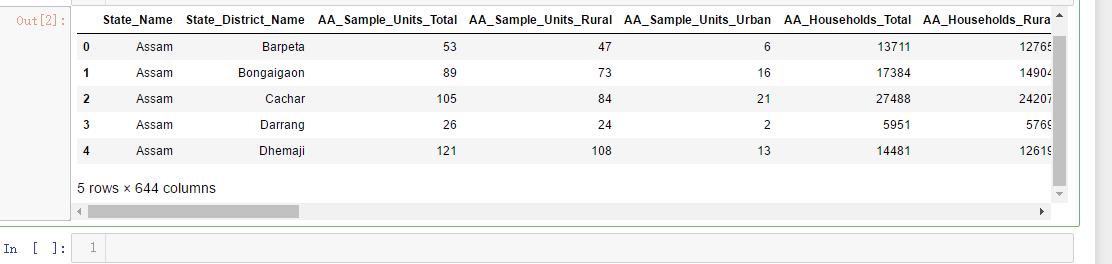
df=pd.read_csv('F:\\kaggleDataSet\\Key_indicator_districtwise\\Key_indicator_districtwise.csv')
df.head()
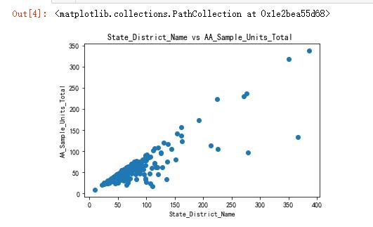
x=df['AA_Sample_Units_Total']
y=df['AA_Sample_Units_Rural']
z=df['AA_Population_Urban']
import matplotlib.pyplot as plt
import seaborn as sns
plt.title('State_District_Name vs AA_Sample_Units_Total ')
plt.xlabel('State_District_Name')
plt.ylabel('AA_Sample_Units_Total')
plt.scatter(x,y)
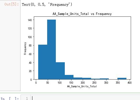
plt.hist(x)
plt.title('AA_Sample_Units_Total vs Frequency')
plt.xlabel('AA_Sample_Units_Total')
plt.ylabel('Frequency')
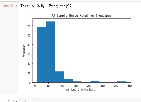
plt.hist(y)
plt.title('AA_Sample_Units_Rural vs frequency')
plt.xlabel('AA_Sample_Units_Rural')
plt.ylabel('Frequency')
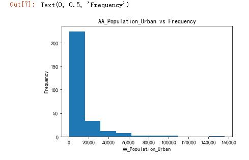
plt.hist(z)
plt.title('AA_Population_Urban vs Frequency')
plt.xlabel('AA_Population_Urban')
plt.ylabel('Frequency')
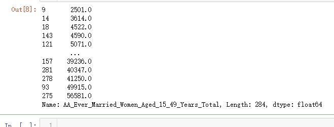
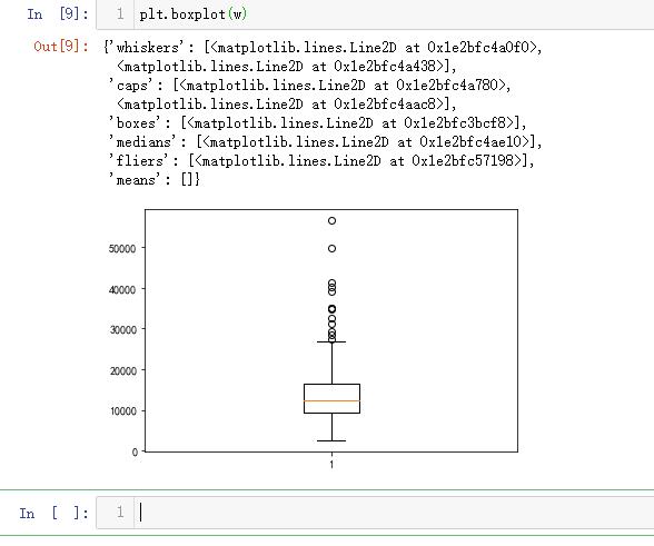
q=df['AA_Ever_Married_Women_Aged_15_49_Years_Total']
q
w=q.sort_values()
w
plt.boxplot(w)
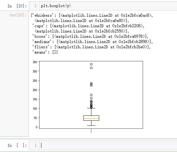
plt.boxplot(y)
import matplotlib.pyplot as plt
import numpy as np
from sklearn import datasets, linear_model, metrics
# load the boston dataset
boston = datasets.load_boston(return_X_y=False)
# defining feature matrix(X) and response vector(y)
X = boston.data
y = boston.target
# splitting X and y into training and testing sets
from sklearn.model_selection import train_test_split
X_train, X_test, y_train, y_test = train_test_split(X, y, test_size=0.4,
random_state=1)
# create linear regression object
reg = linear_model.LinearRegression()
# train the model using the training sets
reg.fit(X_train, y_train)
# regression coefficients
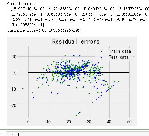
print('Coefficients: \n', reg.coef_)
# variance score: 1 means perfect prediction
print('Variance score: {}'.format(reg.score(X_test, y_test)))
# plot for residual error
## setting plot style
plt.style.use('fivethirtyeight')
## plotting residual errors in training data
plt.scatter(reg.predict(X_train), reg.predict(X_train) - y_train,
color = "green", s = 10, label = 'Train data')
## plotting residual errors in test data
plt.scatter(reg.predict(X_test), reg.predict(X_test) - y_test,
color = "blue", s = 10, label = 'Test data')
## plotting line for zero residual error
plt.hlines(y = 0, xmin = 0, xmax = 50, linewidth = 2)
## plotting legend
plt.legend(loc = 'upper right')
## plot title
plt.title("Residual errors")
## function to show plot
plt.show()
内容总结
以上是互联网集市为您收集整理的吴裕雄--天生自然 python数据分析:健康指标聚集分析(健康分析)全部内容,希望文章能够帮你解决吴裕雄--天生自然 python数据分析:健康指标聚集分析(健康分析)所遇到的程序开发问题。 如果觉得互联网集市技术教程内容还不错,欢迎将互联网集市网站推荐给程序员好友。
内容备注
版权声明:本文内容由互联网用户自发贡献,该文观点与技术仅代表作者本人。本站仅提供信息存储空间服务,不拥有所有权,不承担相关法律责任。如发现本站有涉嫌侵权/违法违规的内容, 请发送邮件至 gblab@vip.qq.com 举报,一经查实,本站将立刻删除。
内容手机端
扫描二维码推送至手机访问。
来源:【匿名】